Edena
Branding, Brand Strategy, Packaging
Edena is a naturally crafted skin-care line that is deeply in touch with Mother Earth
The Brief
Skin-care is on the high right now, and with thousands of beauty brands out there we never stop to think about what is actually in them. Edena's story comes from being one with the earth and using its natural gifts to take care of our skin and our planet. With naturally and ethically sourced ingredients, Edena is here to make you look and feel beautiful within nature.
The Solution
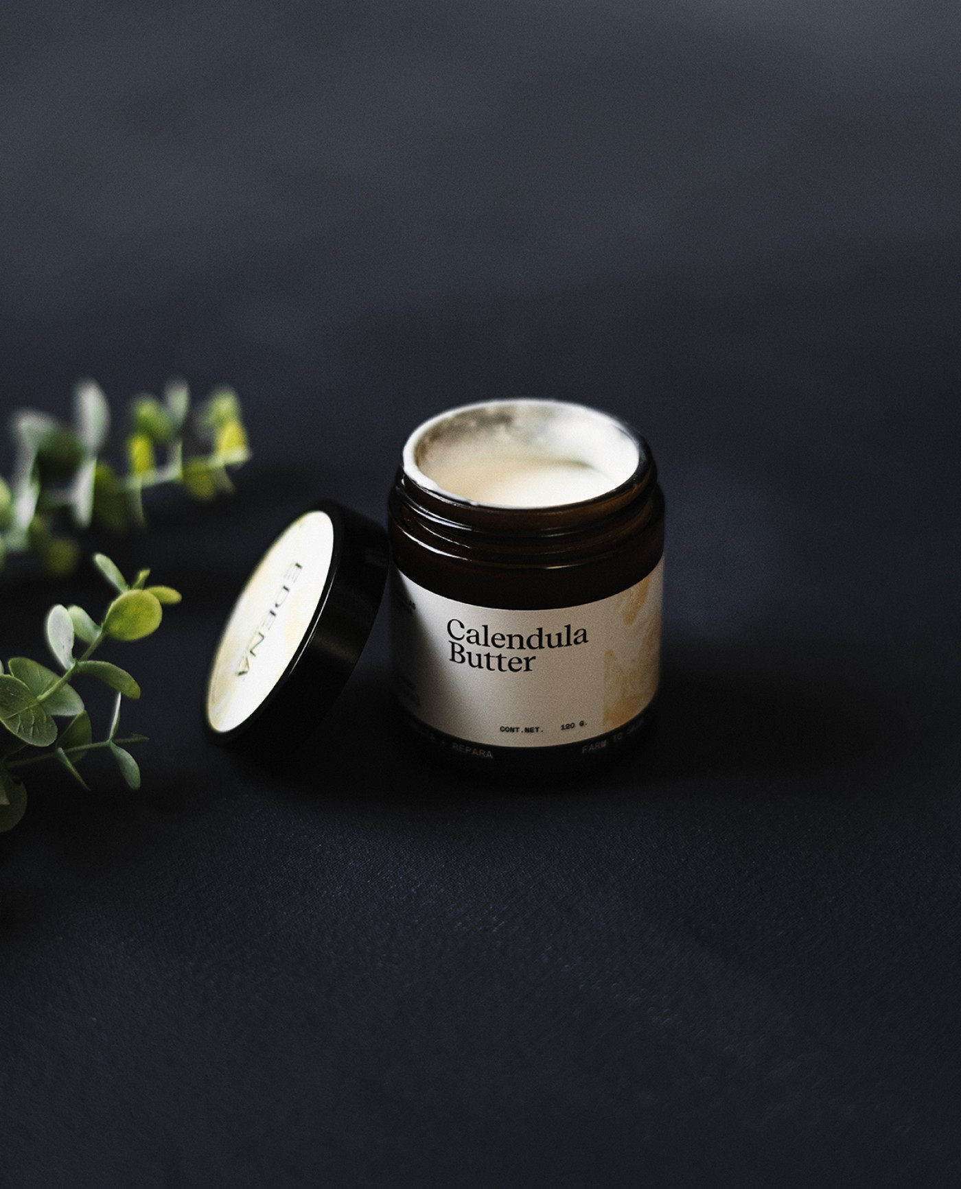
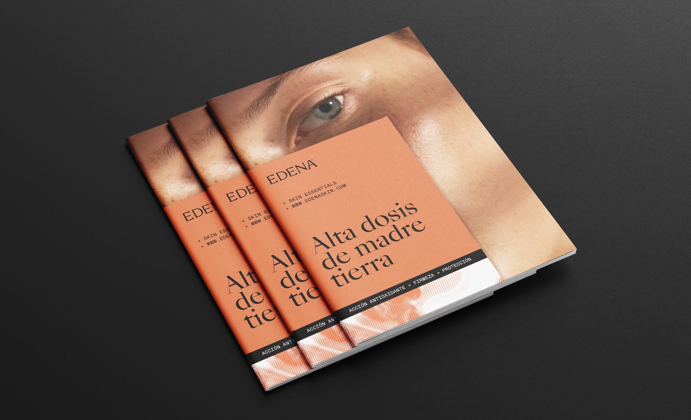
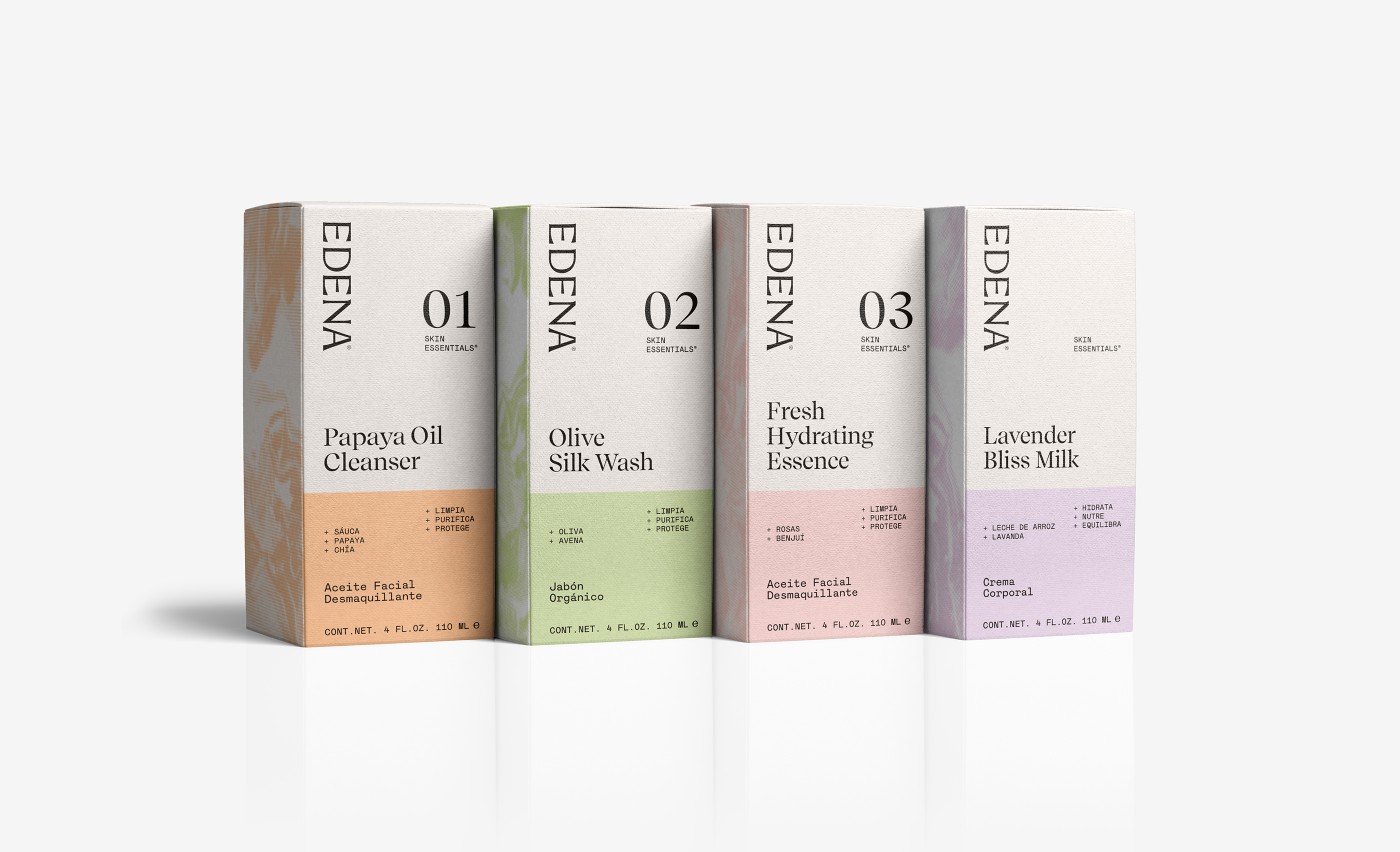
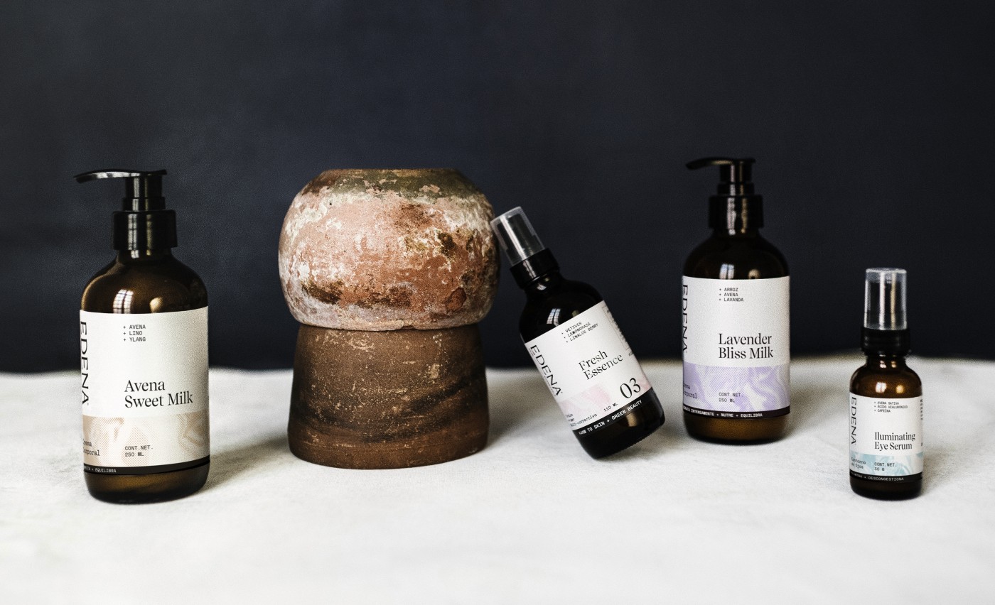
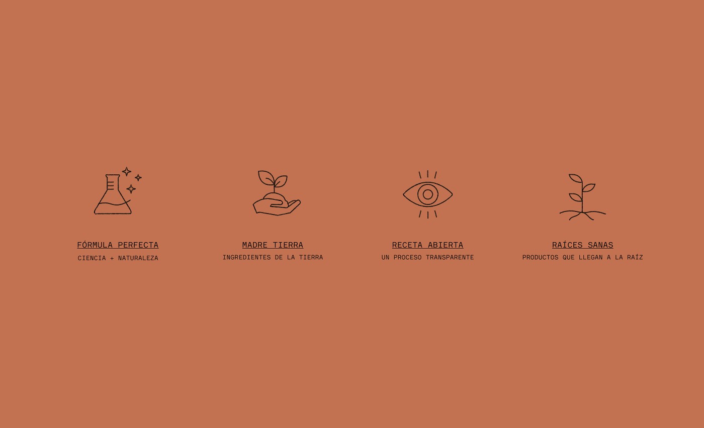
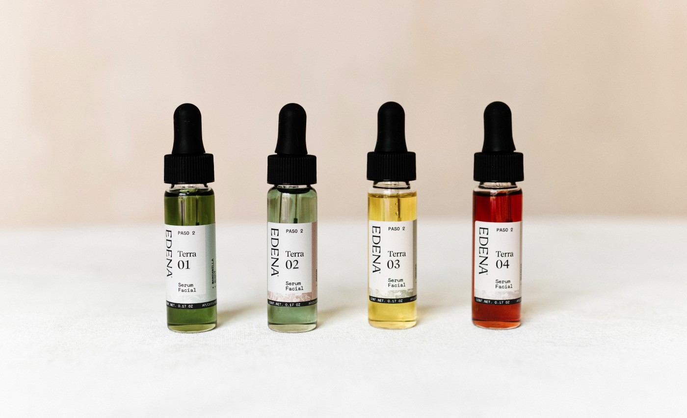
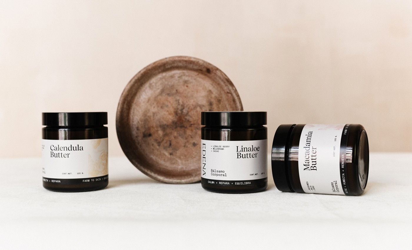
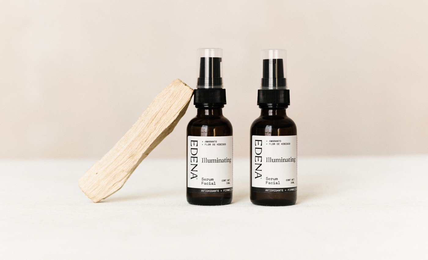
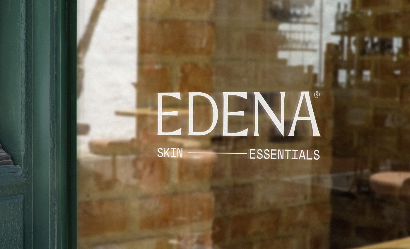
When designing the brand, we had to keep it natural without falling into the stereotypical lines of natural products. Keeping elegance as our main ingredient in the brand, we created special elements that connect Edena with Earth but also connecting with femininity and organic beauty.
In the end, we used Mother Nature's wisdom and beauty to create a brand that embodies nature in a new and unexpected way.
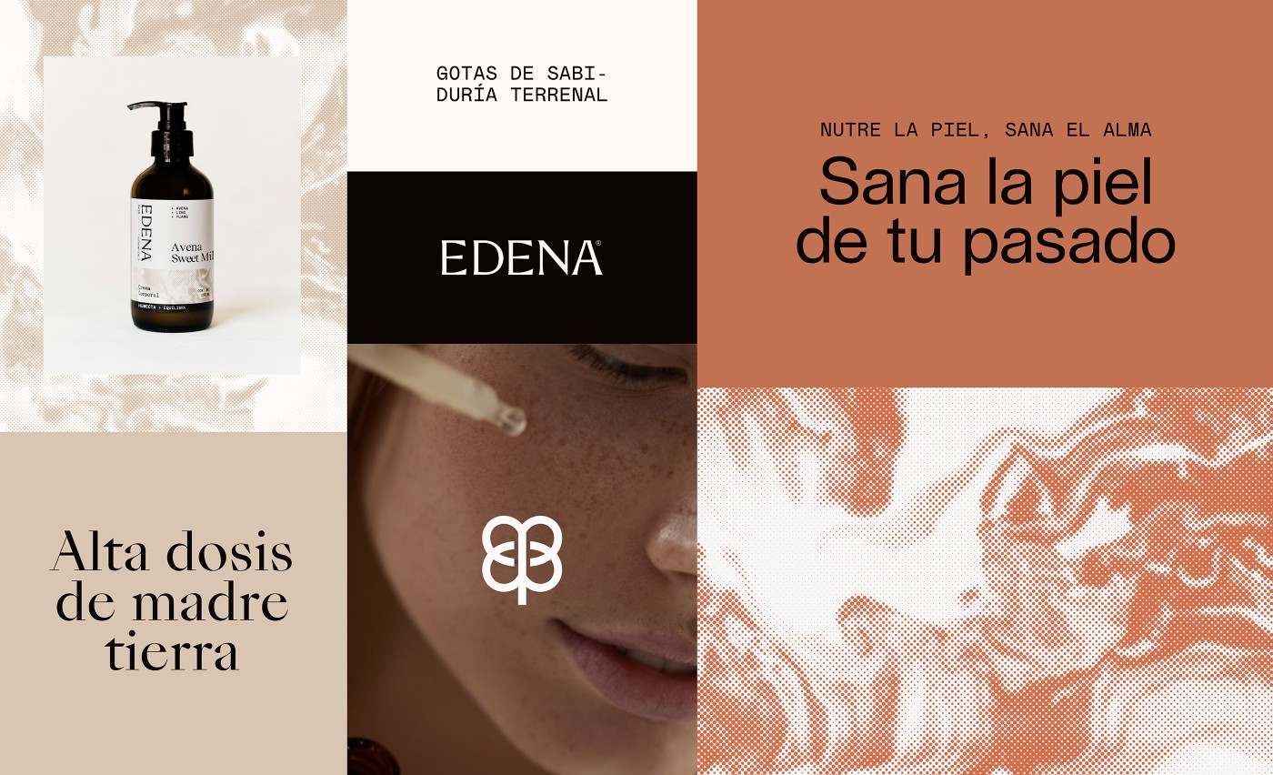
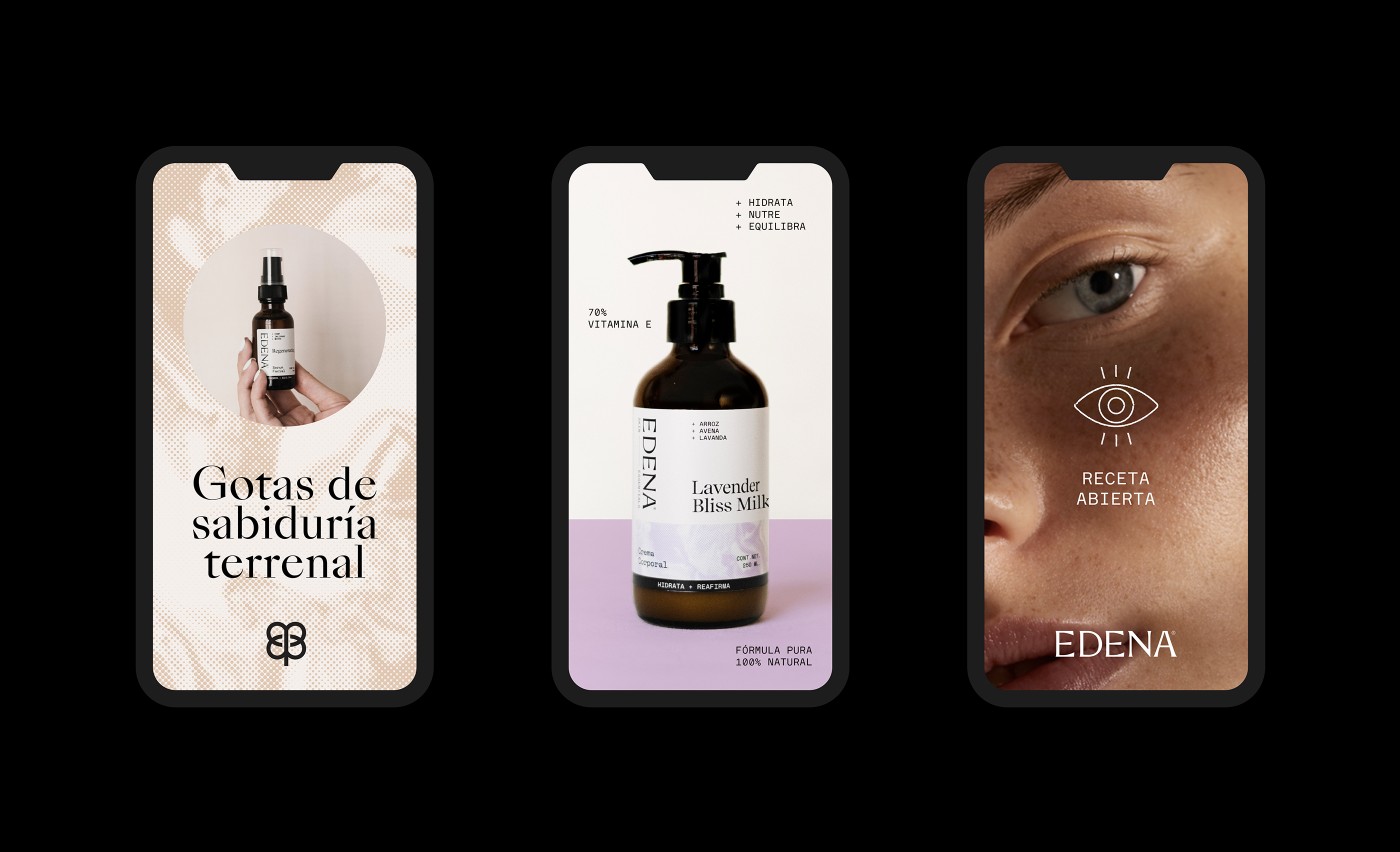
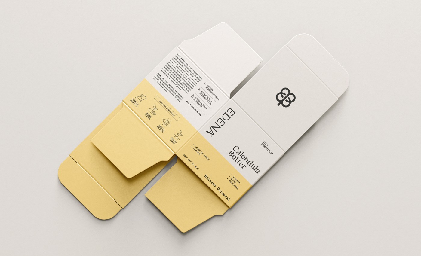
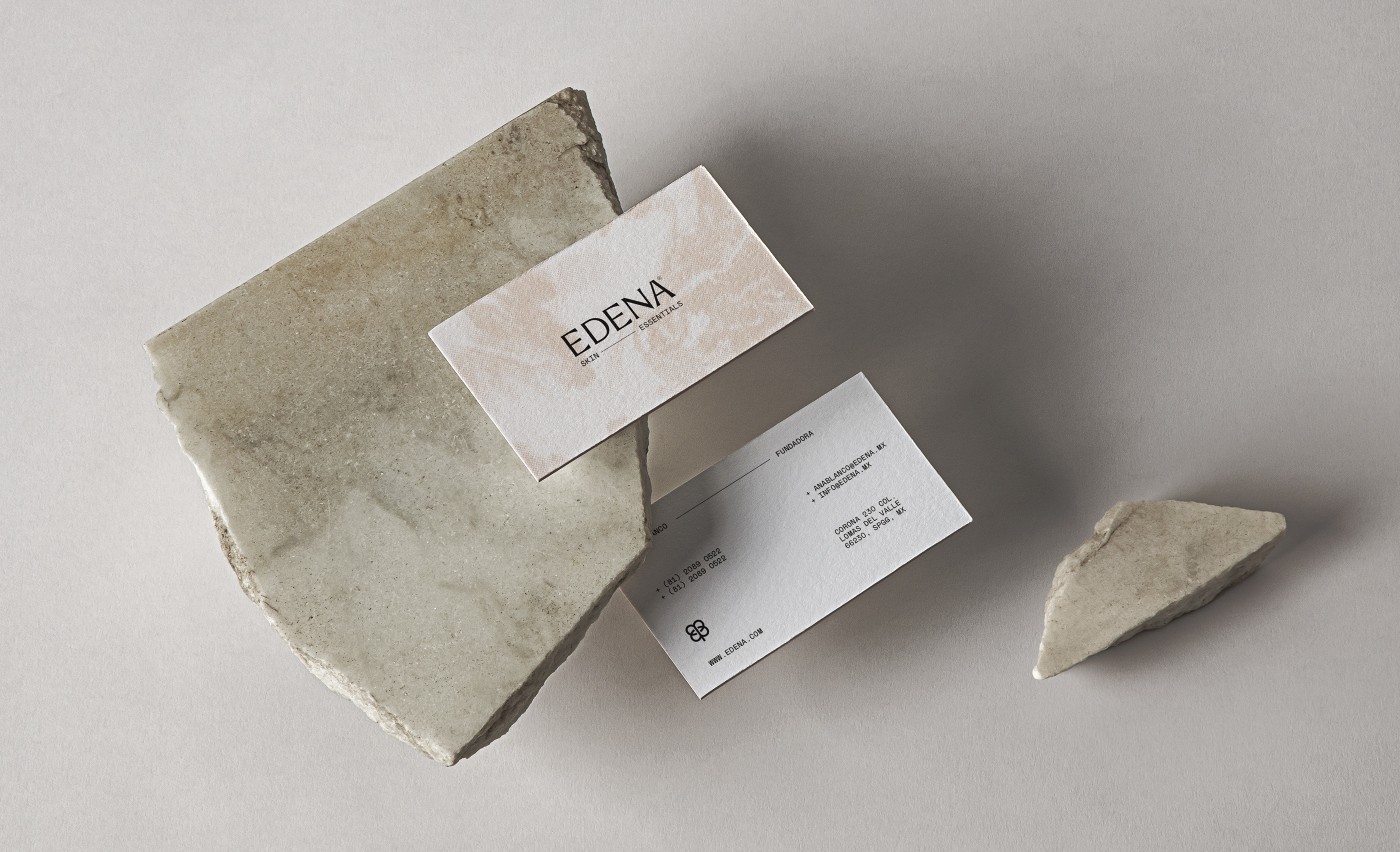
The mark is cleverly made out of two abstract "E"´s that when connected create a natural symbol resembling a four-leaf clover. This mark's simplicity is the essence of Edena, to simply live and love the Earth and nature arounds us.
We created an enigmatic texture pattern to give the brand depth and meaning. Skin is our essence and our own unique texture. This multi-chromatic texture is used in packaging, social media, and different applications to create the illusion of nature without falling into the ordinary.
Credits
Creative director: Mercedes Arce
Copywriting: Andrea de la Mora
Project Manager: Paulina Zaragoza Tags Nature, Skincare, Organic
Copywriting: Andrea de la Mora
Project Manager: Paulina Zaragoza Tags Nature, Skincare, Organic



Cliente: Edena
Work:
Consumer

