Comaluna
Branding, Identity, Packaging
Comaluna is a pastry shop inspired in an out of this world experience - a world of cheese!
The Brief
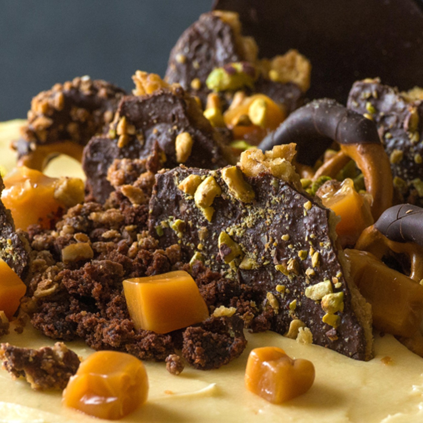
Passed down by three generations, their recipes are full of detail and tradition, and the combination of their textures and flavors make their desserts extraordinary. Every cheesecake takes around 5 hours to bake, and the result is a perfectly textured cake with no break outs.
The Solution
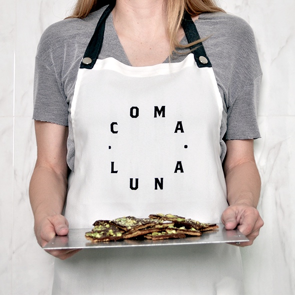
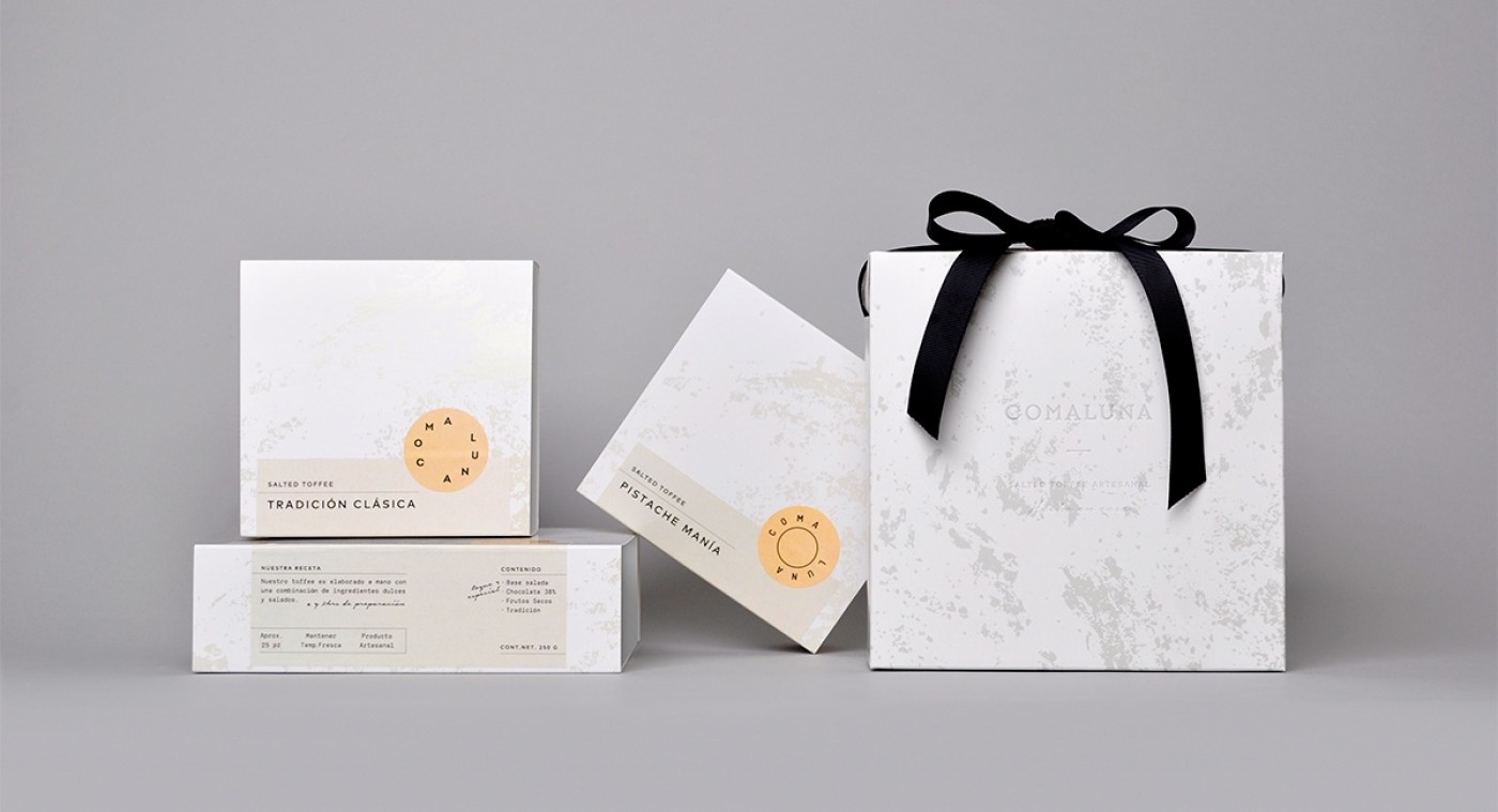
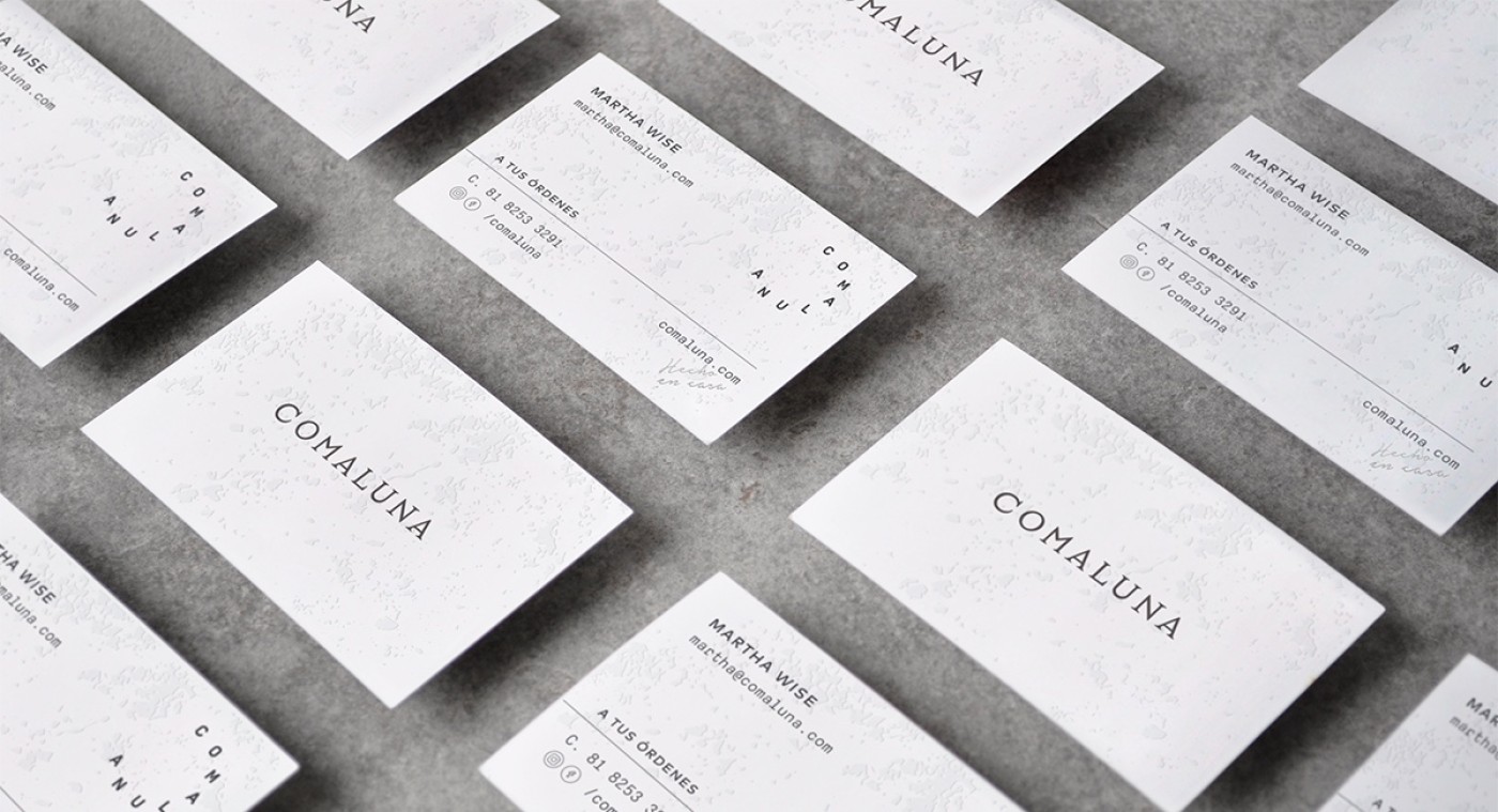
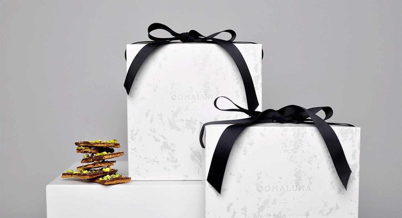
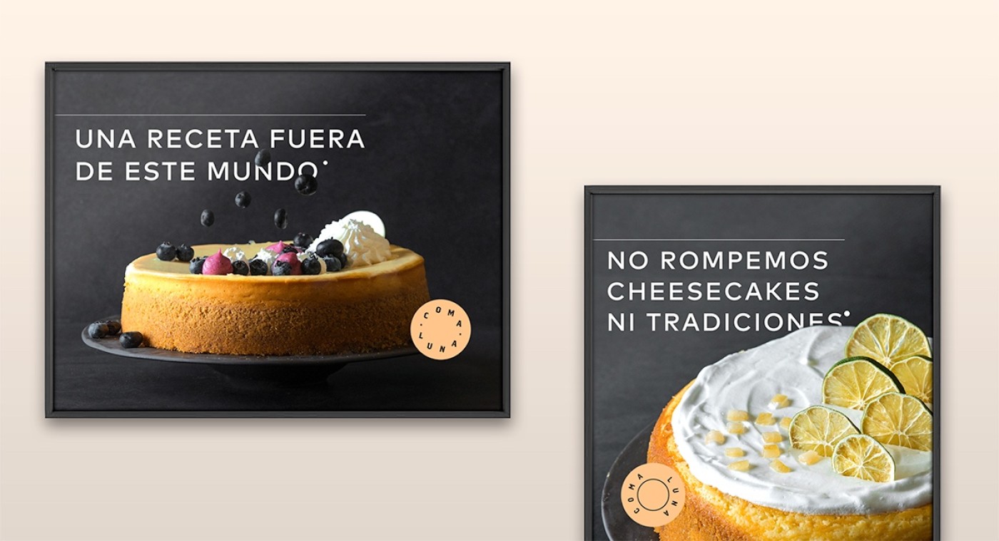
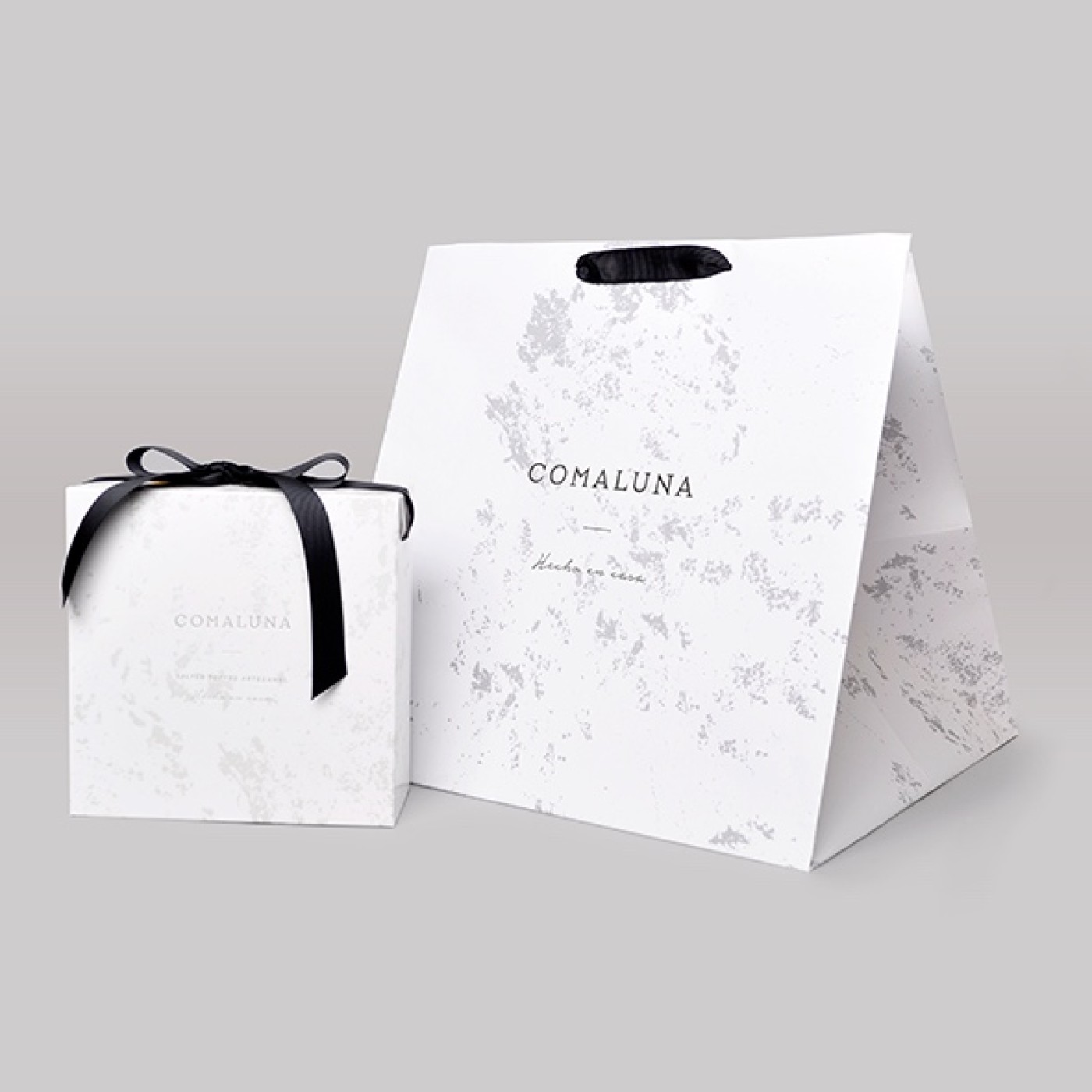
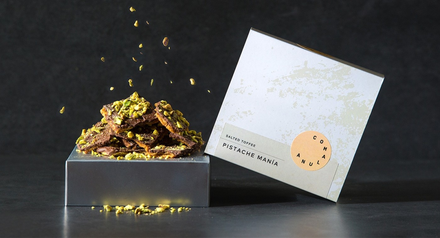
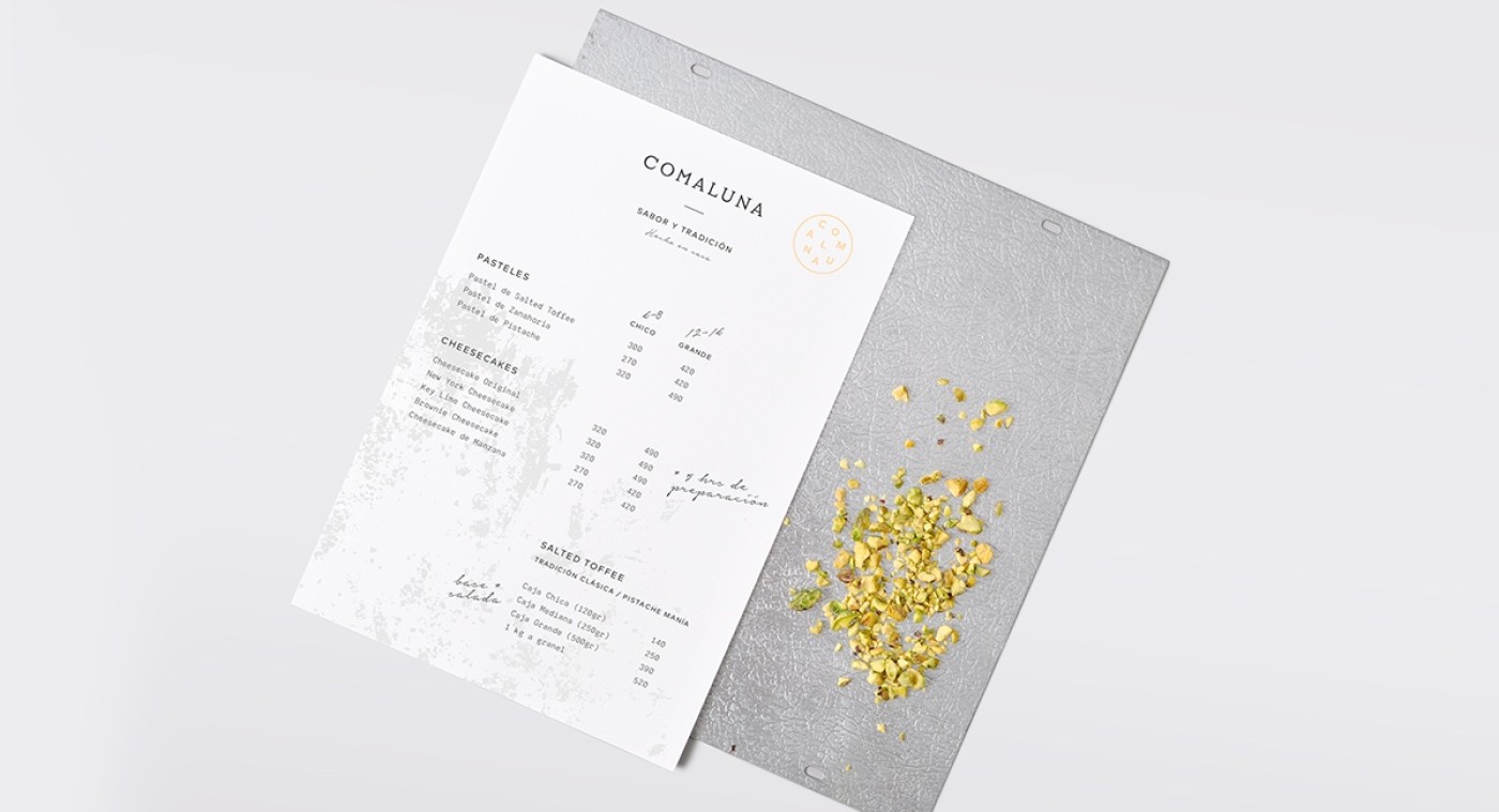
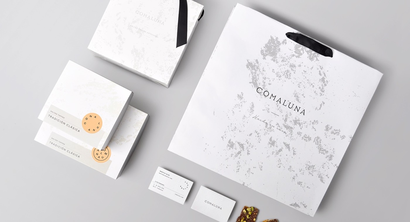
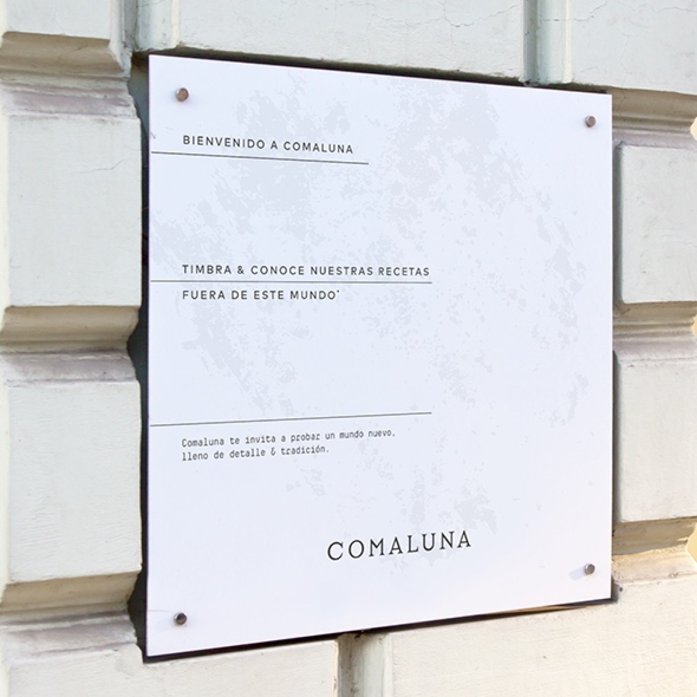
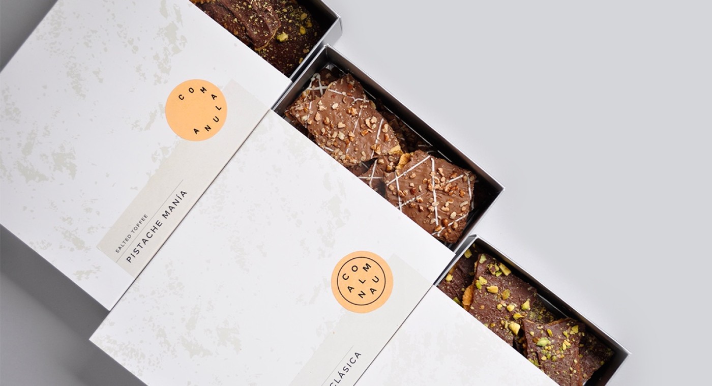
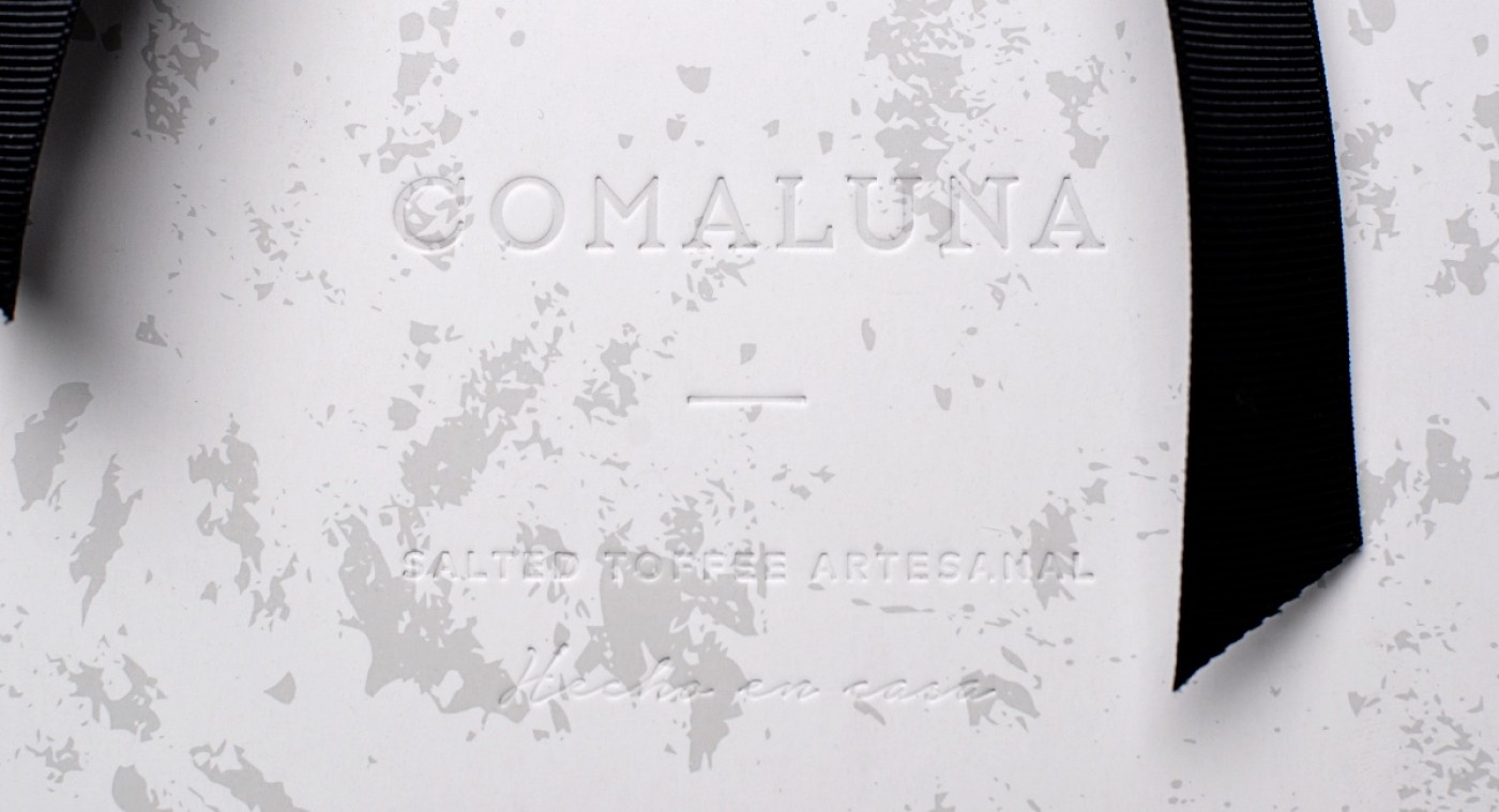
he concept behind the brand is built around the moon, taking as reference children’s books and the idea that the moon is made of cheese. The name is a translation of a play with the words Eat and Moon. The pattern depicts an image of the world from outer space. The variations in the logotype configuration were inspired in the different phases of the moon, and its movement revolving our planet. Visual and typographic styles were inspired in a traditional recipe sheet, which contains traditional elements, but also handwritten notes and a hint of modernism.
Comaluna raises the bar on traditional pastry shops. Their cheescakes and toffee give the customer an invitation to experience an out of this world dessert. They speak of tradition, expertise, and the perfection of a well-crafted recipe that is ready to please even the most demanding palates. You’ll love them to the moon and back!
Comaluna raises the bar on traditional pastry shops. Their cheescakes and toffee give the customer an invitation to experience an out of this world dessert. They speak of tradition, expertise, and the perfection of a well-crafted recipe that is ready to please even the most demanding palates. You’ll love them to the moon and back!
Credits
Project Manager: Paulina Zaragoza
Creative: Mercedes Arce
Copywriting: Andrea de la Mora
Tags Pastry, Cheescakes, Tradition, Branding, Packaging
Creative: Mercedes Arce
Copywriting: Andrea de la Mora
Tags Pastry, Cheescakes, Tradition, Branding, Packaging


Cliente: Comaluna
Work:
Food & Drink
