Mirlo
Branding, Copywriting, Identity
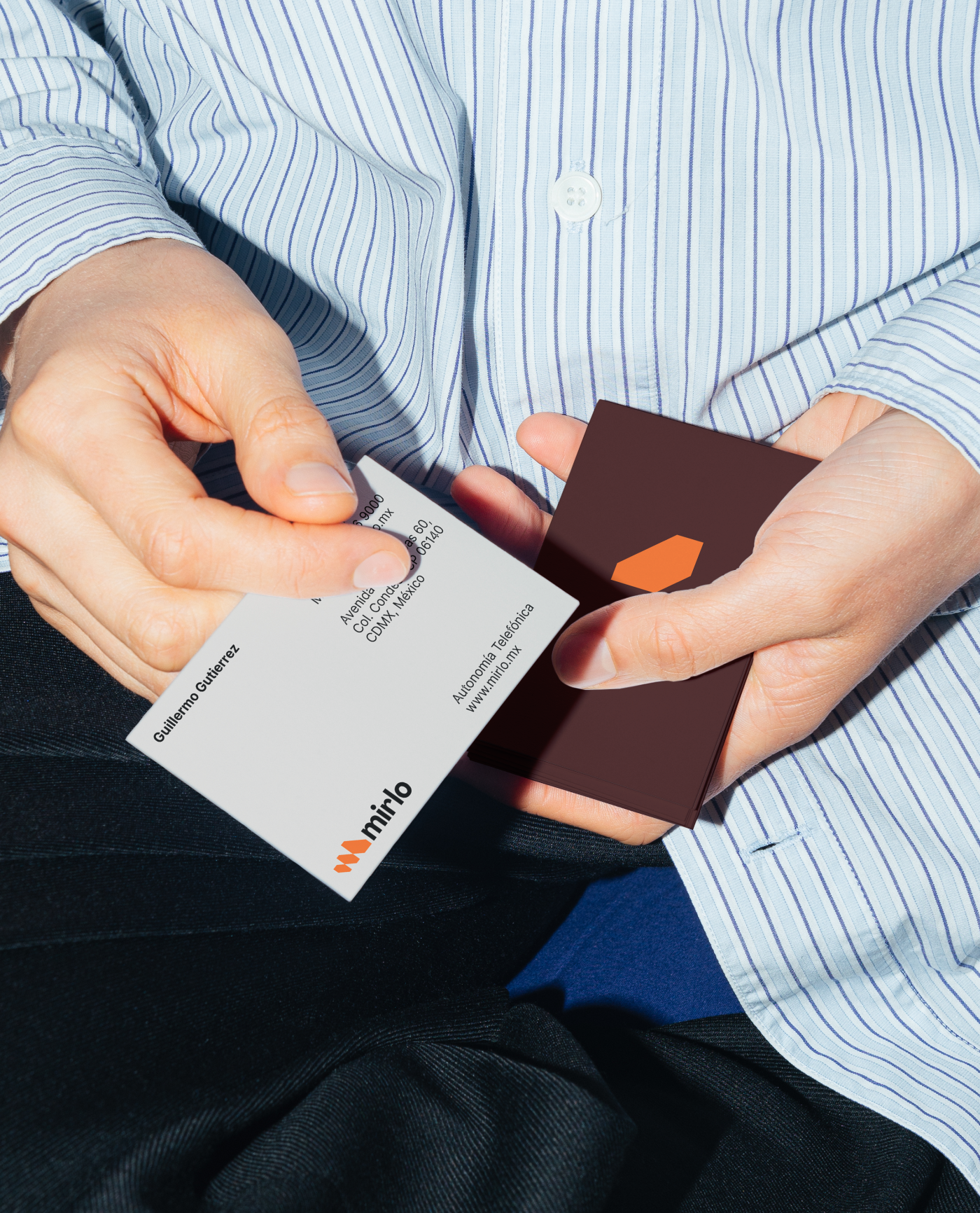
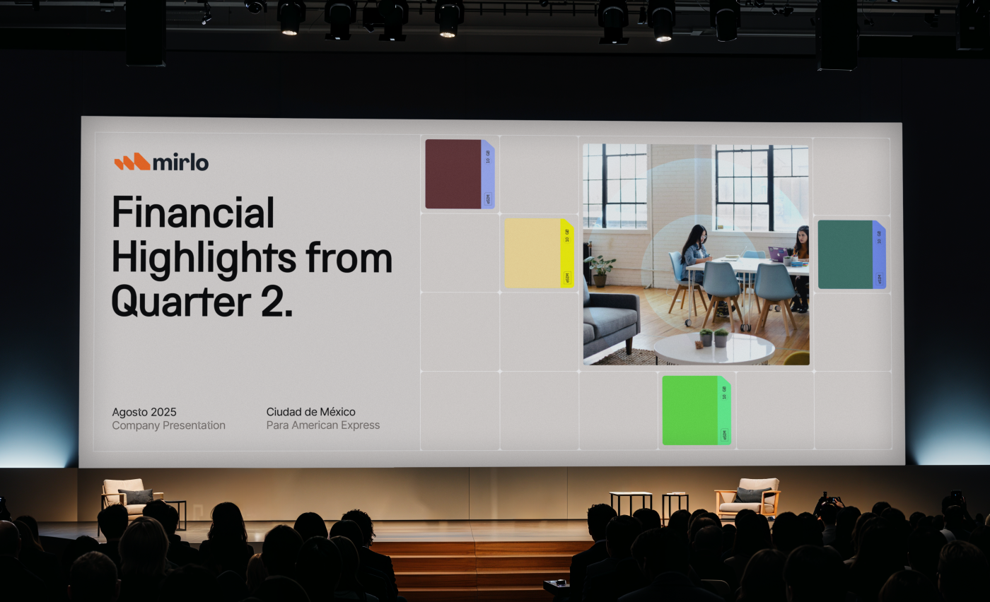
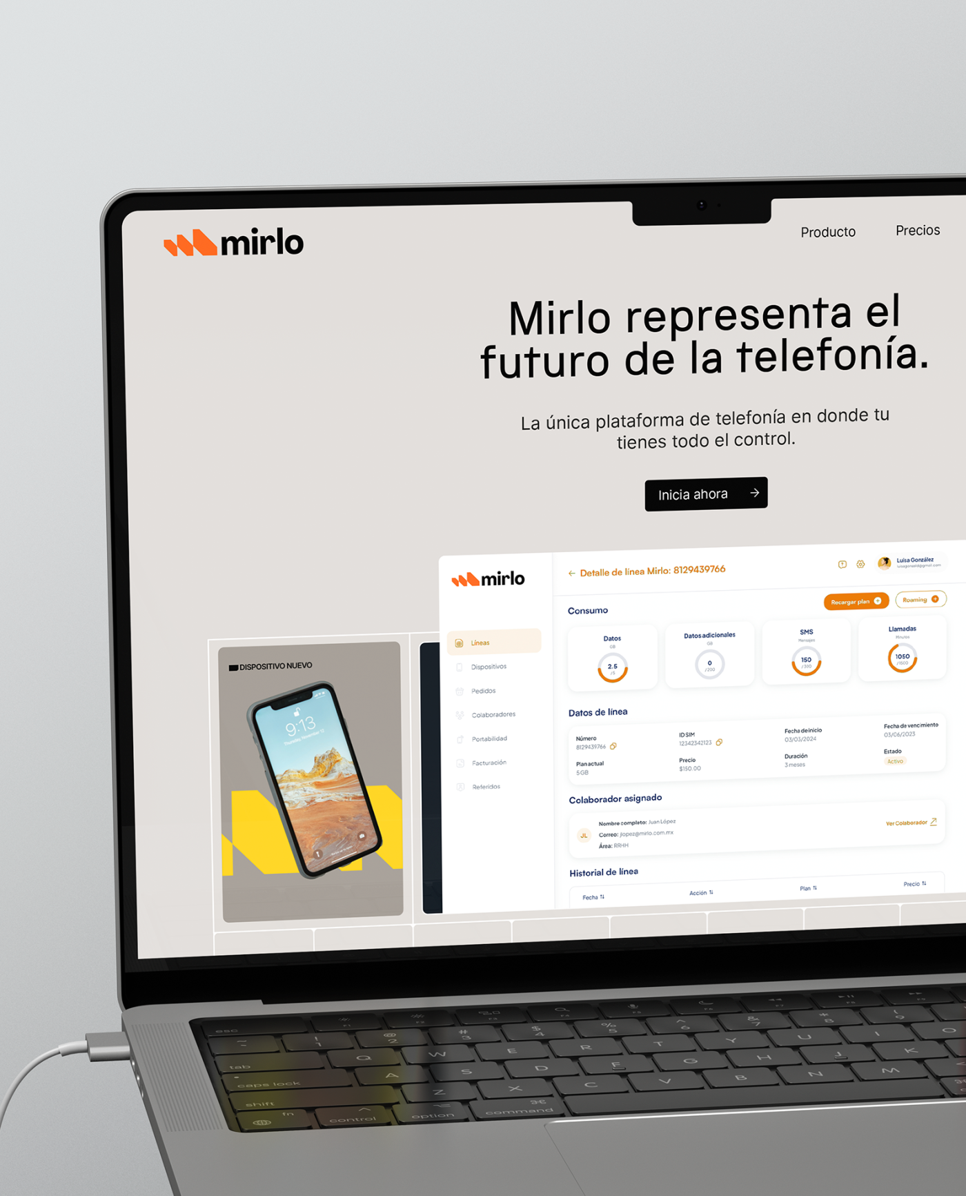
Mirlo is a new phone service provider disrupting Mexico’s telecom industry.
The Brief
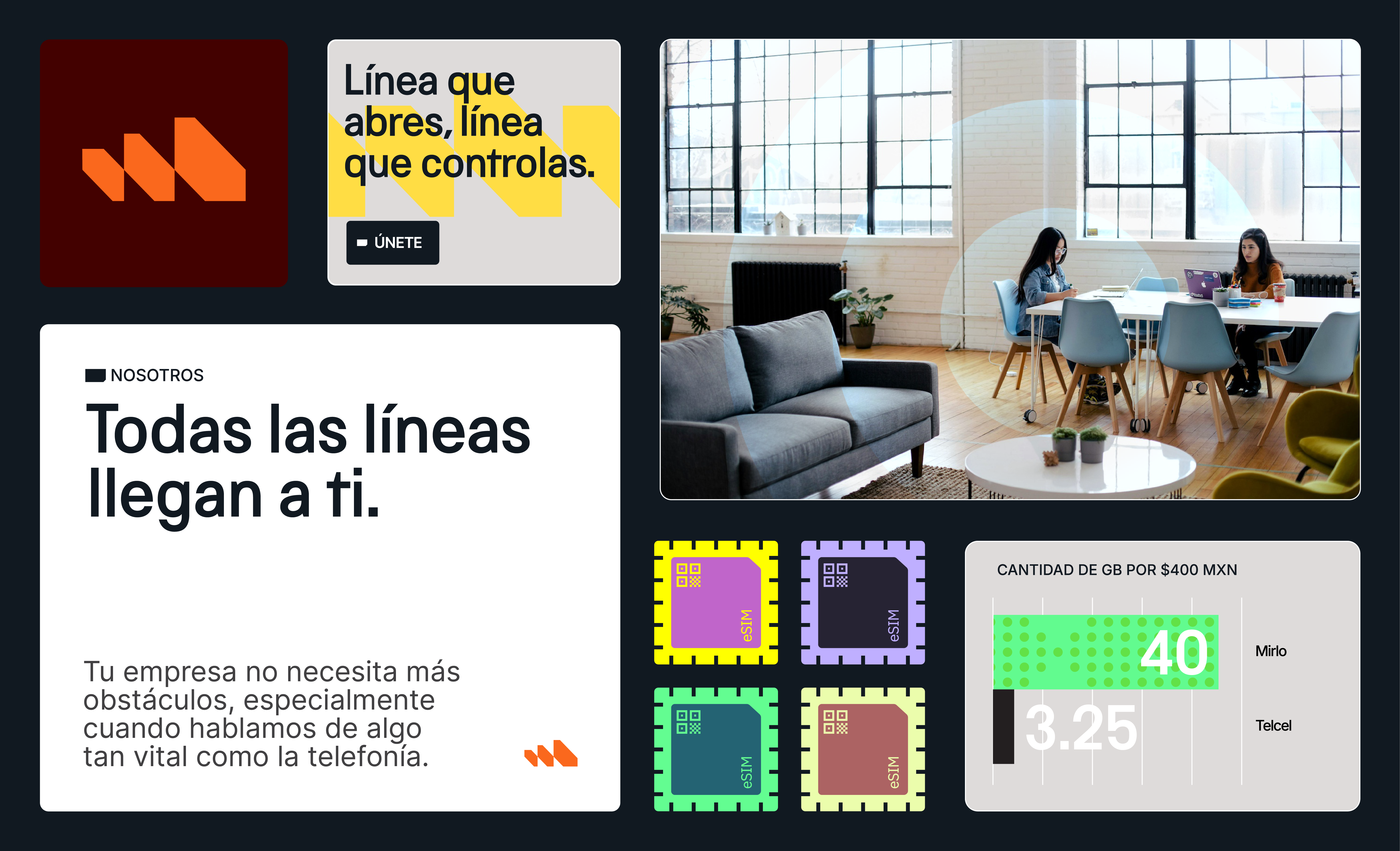
Mirlo is not just another phone company, it’s a revolution. In a market long controlled by a single dominant player, Mirlo challenges the status quo, offering a fresh alternative built on transparency, simplicity, and user autonomy.
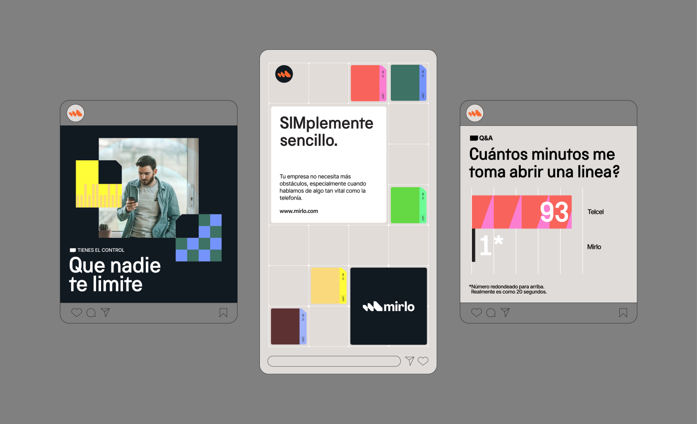
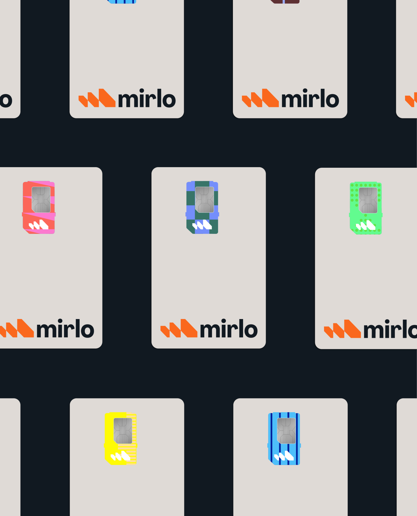
At the core of Mirlo’s identity is the belief that connectivity should be seamless and empowering. The brand’s visual language reflects this ethos: bold yet approachable, modern yet intuitive.
At the core of Mirlo’s identity is the belief that connectivity should be seamless and empowering. The brand’s visual language reflects this ethos: bold yet approachable, modern yet intuitive.
The Solution
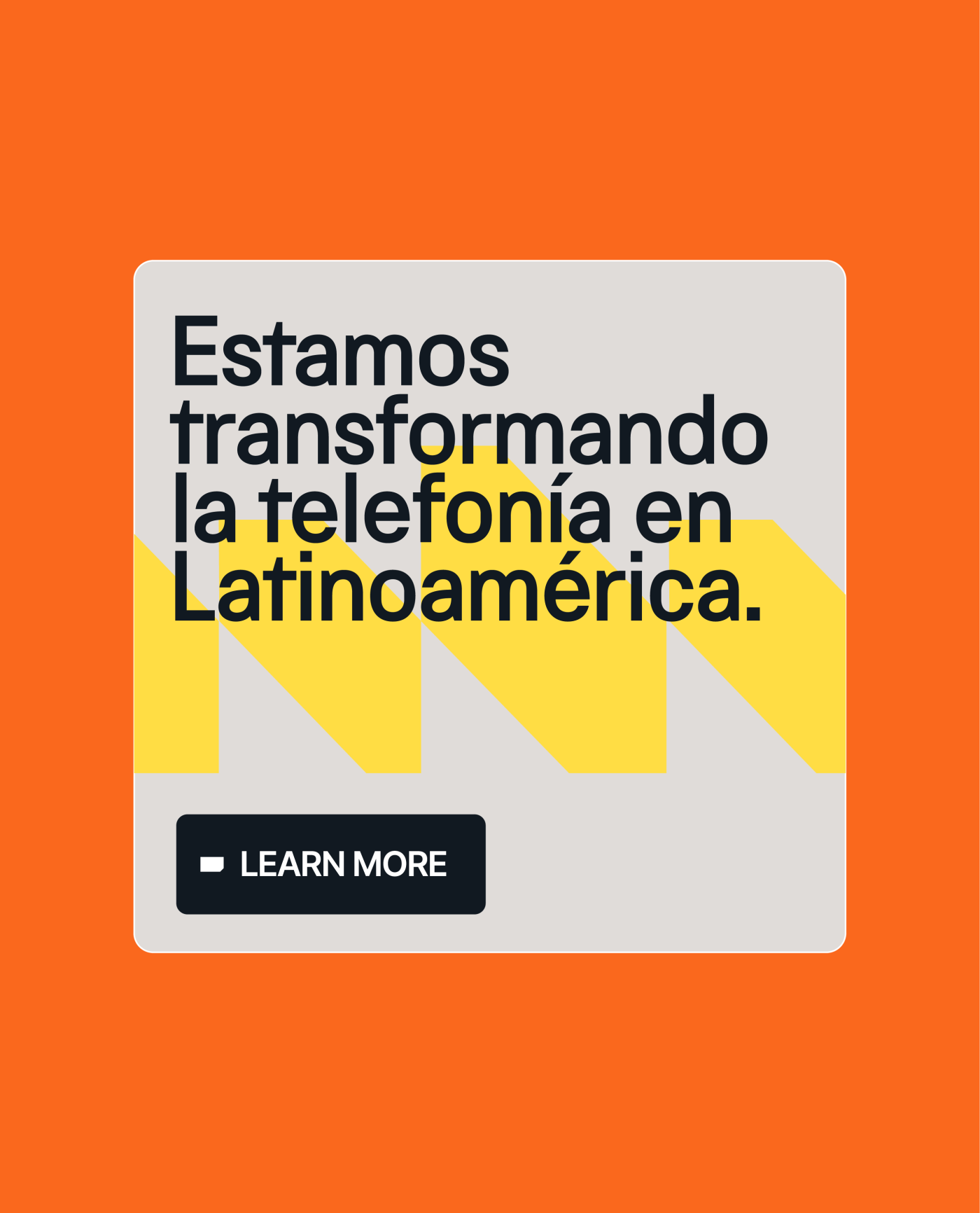
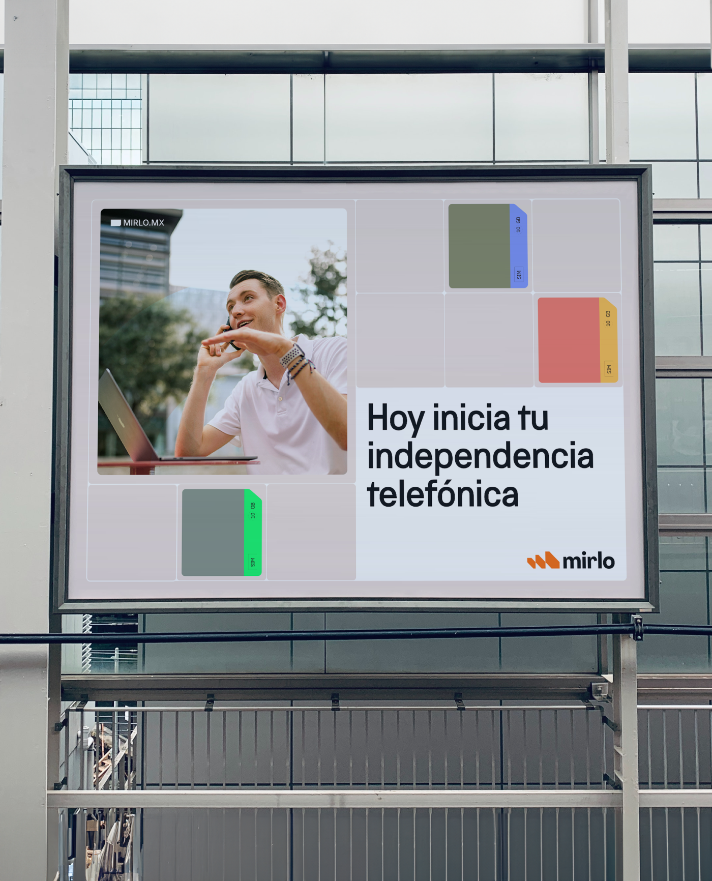
Every element, from its name to its dynamic messaging, reinforces the idea of freedom. Freedom from bureaucracy, from outdated processes, from feeling trapped in a system that no longer serves its users.
Mirlo’s tone is direct, confident, and refreshingly clear. With phrases like “Bueno? Es Mirlo” and “Con Mirlo, sabes con quien hablas.”, it speaks to a new generation that demands efficiency and control over their own data, plans, and communication.
More than a service, Mirlo is a movement. It signals the dawn of a new era in Mexican telecom, one where users finally have a choice, and that choice is theirs to make.
Credits
Tags
Web Design, Branding, Copywriting

Cliente: Mirlo
Work:
Technology