Knock the Wok
Branding, Identity, Logotype
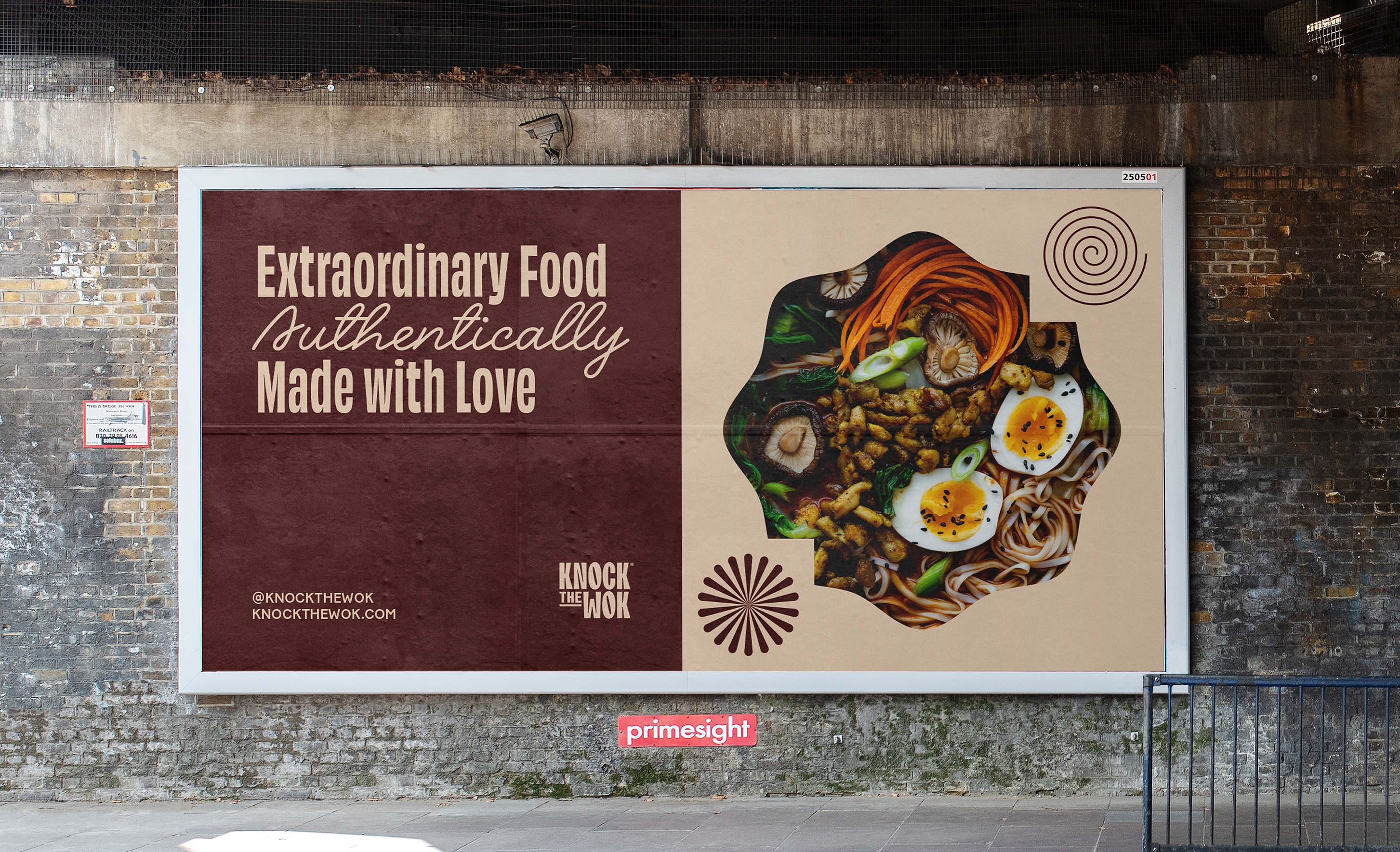
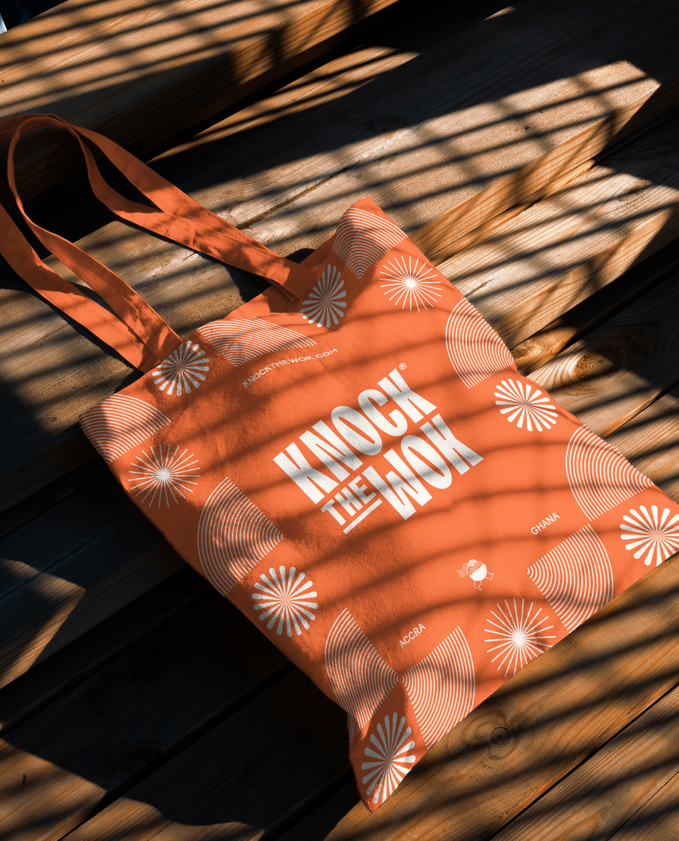
Knock The Wok is a bold Asian fusion restaurant part of the Boundary Road Food Market in Accra, Ghana.
The Brief
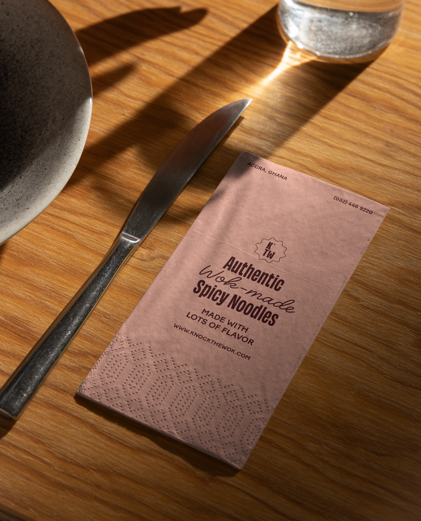
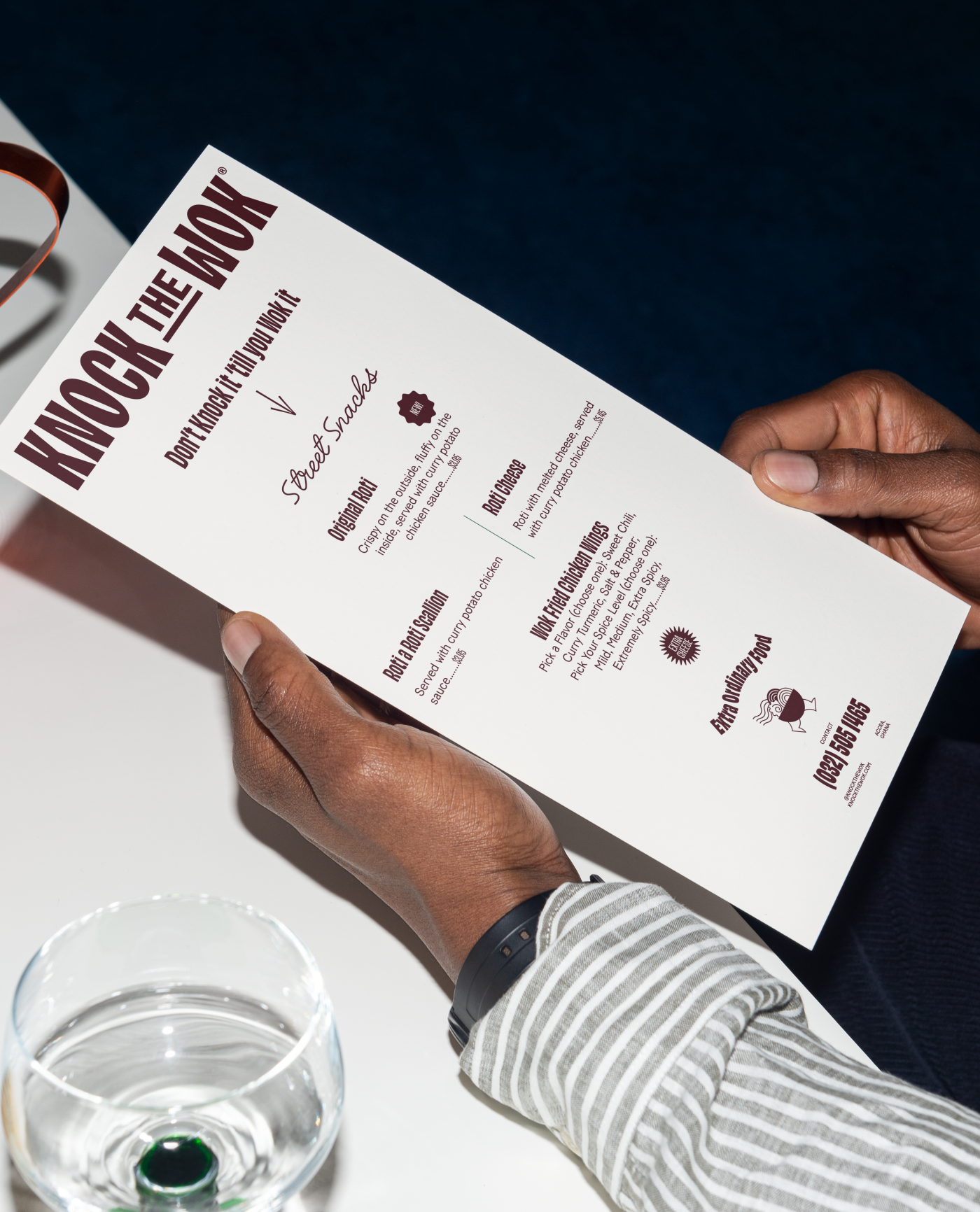
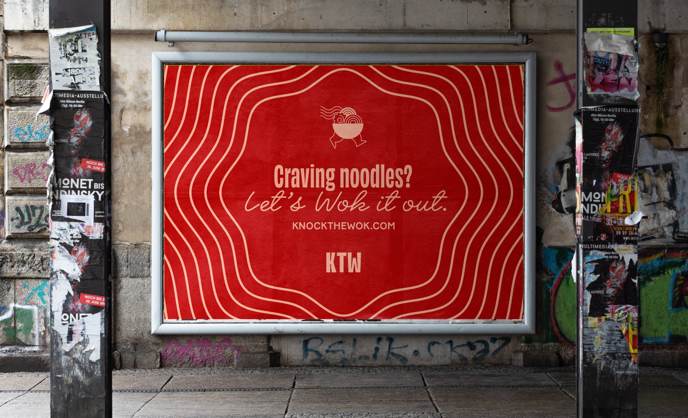
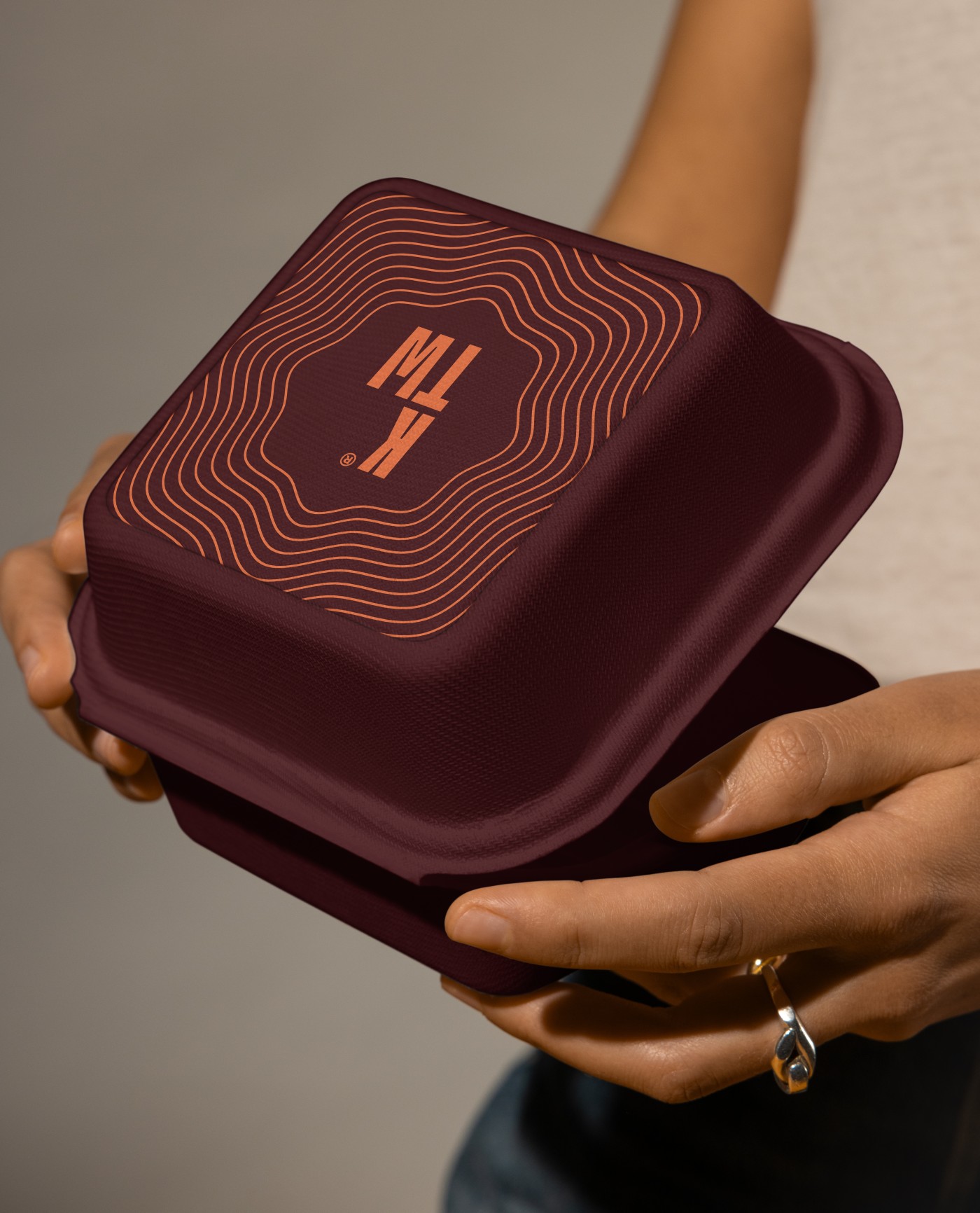
Inspired by the rhythmic clatter of a wok in action, its name captures the energy, heat, and excitement of street-style cooking. More than just a place to eat, Knock The Wok is a full-on flavor experience, an explosion of colors, sounds, and wok-fired magic that turns every meal into a spectacle.
The Solution
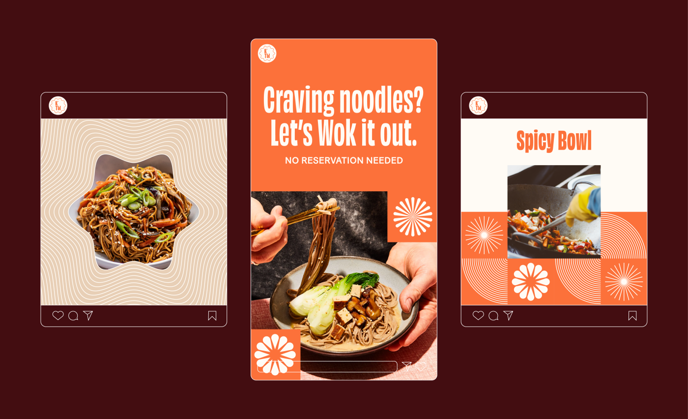
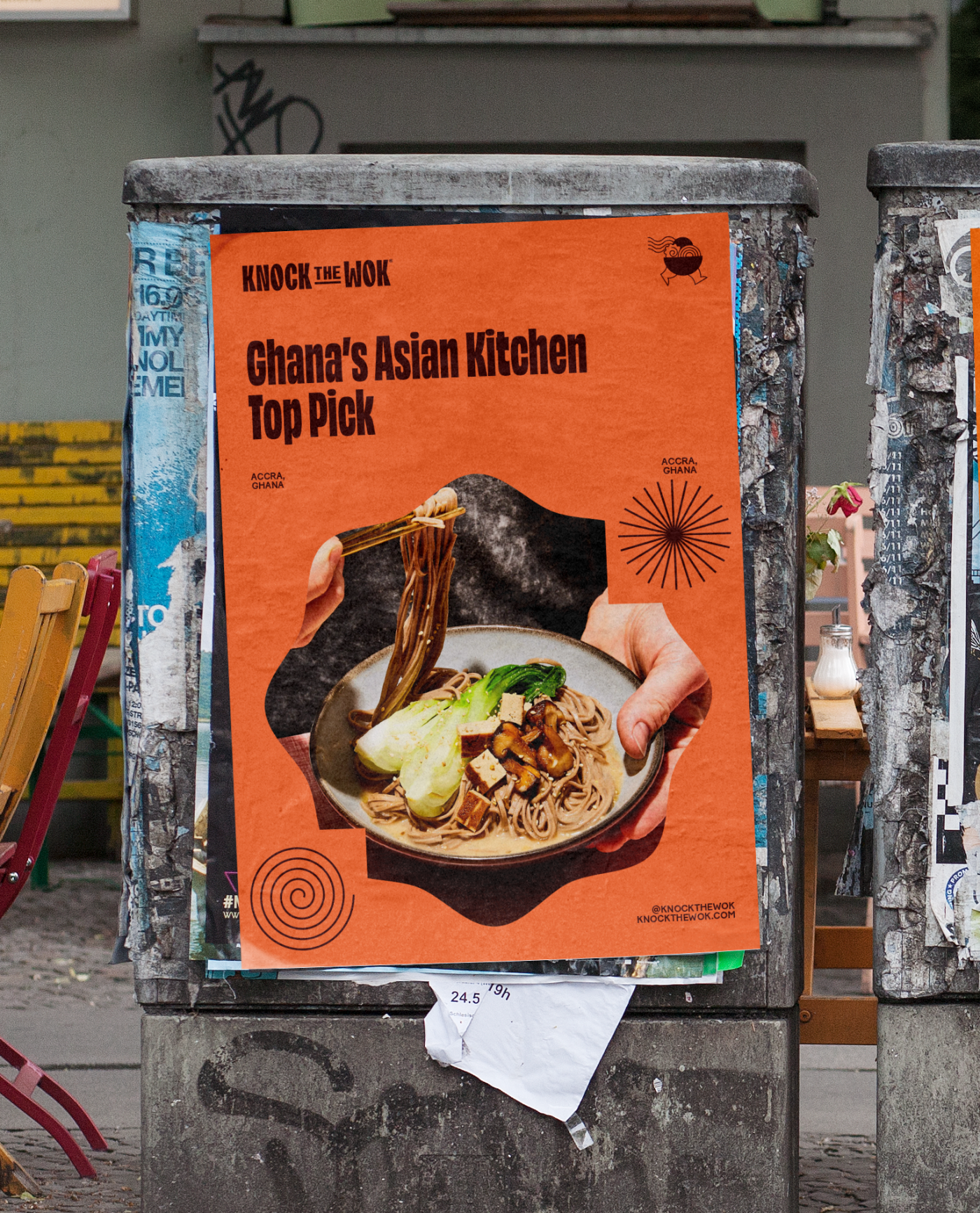
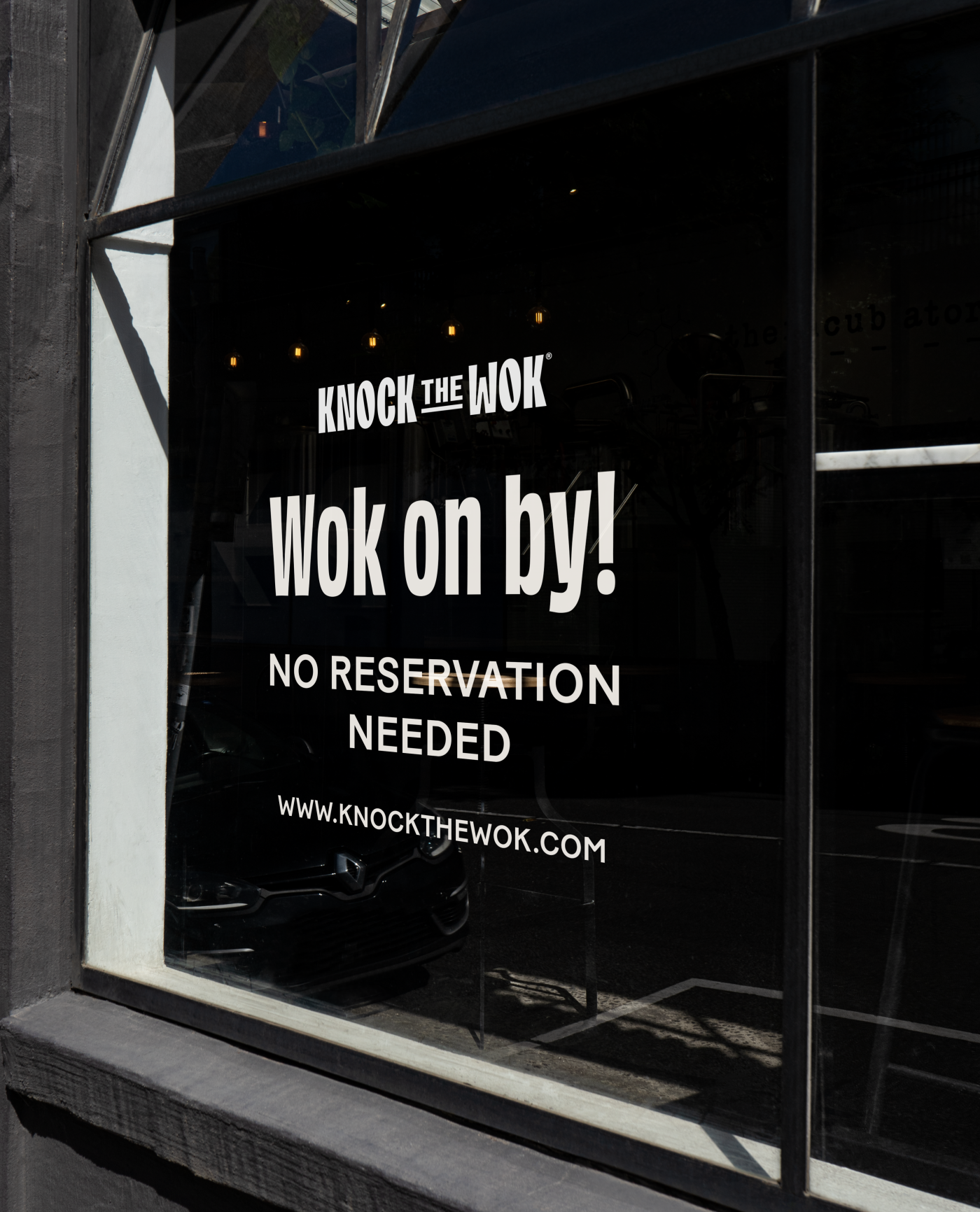
At Firmalt, we brought this energy to life through a dynamic brand identity. The bold color palette takes inspiration from the vibrant hues of flame, spice, and smoke, while graphic elements mimic the motion and intensity of a sizzling wok. Playful onomatopoeias and expressive typography add to the sense of movement, making the brand feel as alive as the kitchen itself. Every design choice amplifies the restaurant’s high-energy essence, turning Knock The Wok into more than just a name, it’s an invitation to taste, hear, and experience the excitement of wok-fired cooking.
Credits
Creative Director: Manuel Llaguno
Lead Designer: Victor Escobar
Lead Copywriter: Andrea De La Mora
Project Manager: Paulina Robles Tags
Lead Designer: Victor Escobar
Lead Copywriter: Andrea De La Mora
Project Manager: Paulina Robles Tags


Cliente: Knock The Wok
Work:
Food & Drink