Groovies
Branding, Copywriting, Packaging
Groovies is a quinoa-based cereal made for those who start their day looking for adventure.
The Brief
We all remember those easy mornings when we were young. You'd get up, get dressed, and a flavorful array of cereal boxes were waiting to be chosen and enjoyed. It was the easiest and yummiest way to start the day. We grew up, but cereal didn't evolve with us.
Today, we gravitate towards healthier options. Excess sugar, gluten, artificial flavors and preservatives are all things of the past. But we still crave that nostalgic and practical breakfast we enjoyed as kids.
Along came Groovies, a delicious quinoa powered cereal with all of the good stuff and none of the bad. This gluten-free cereal is on a mission to bring cereal real, and we're here for it!
The Solution
This brand was a joy to make. From its ingredients to its core story, it's all is about adventure, fun and finding your groove in life. We wanted to create a magical world around the brand that would appeal to adults as well as children.
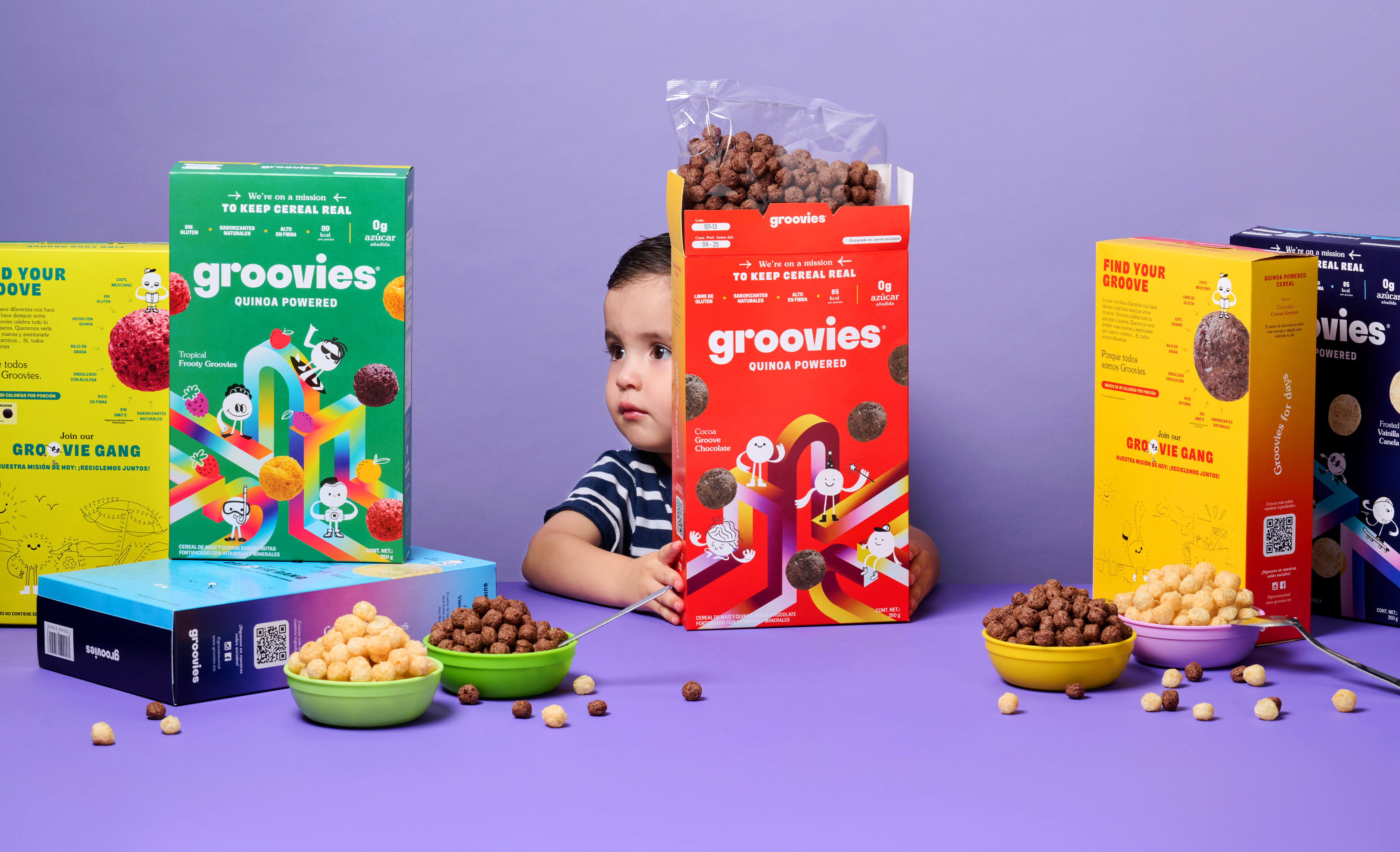
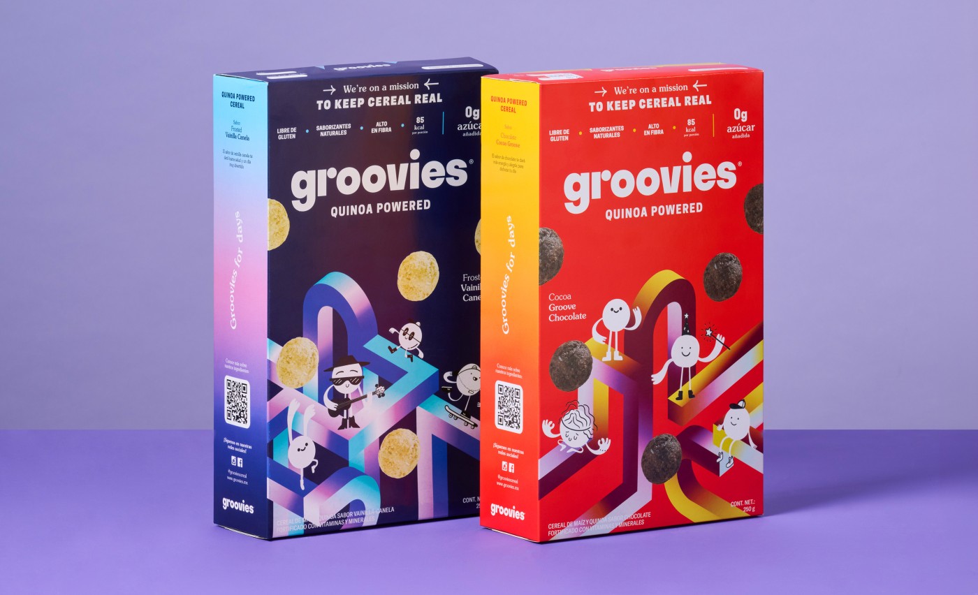
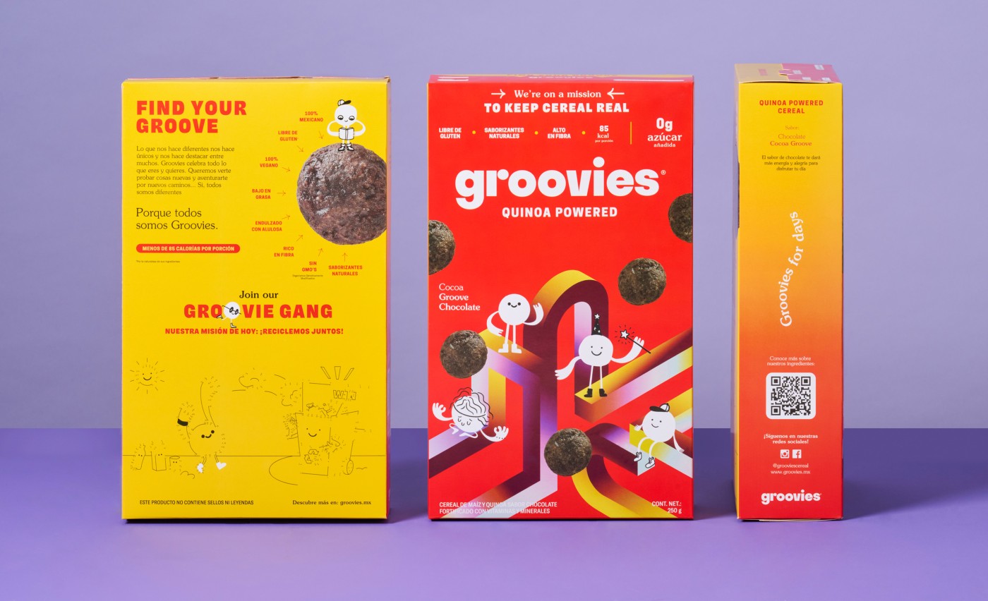
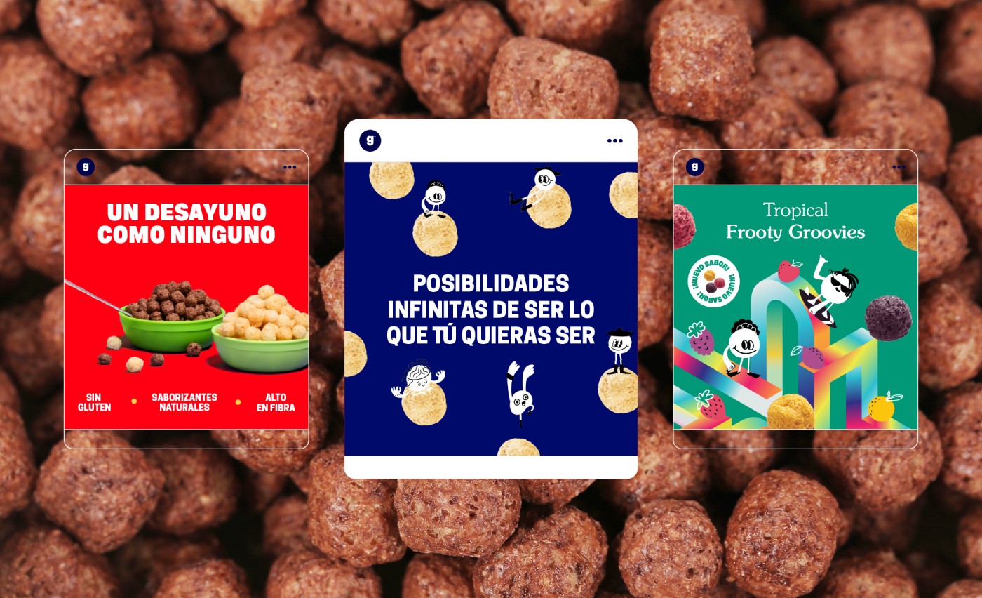
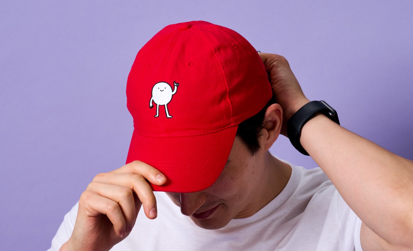
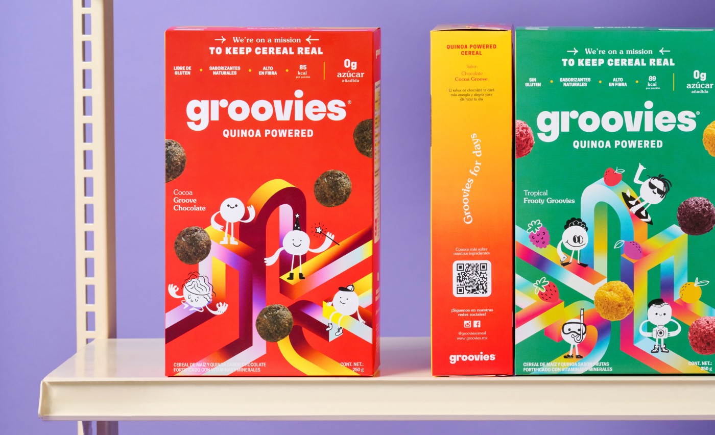
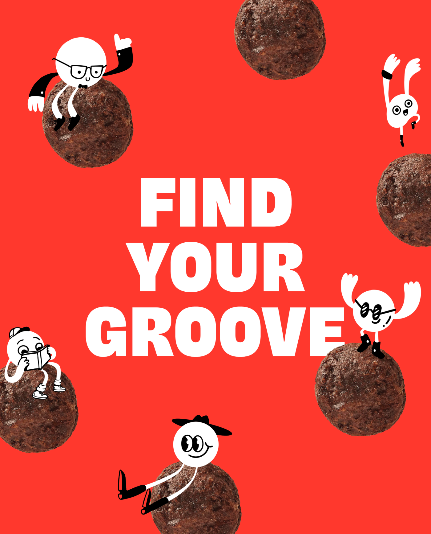
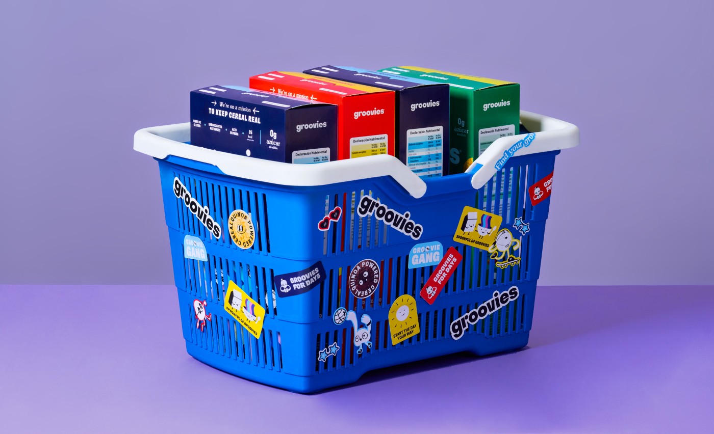
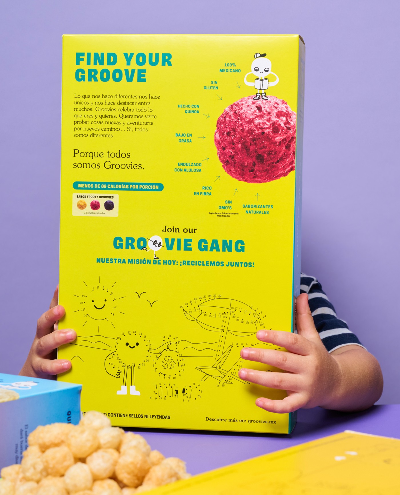
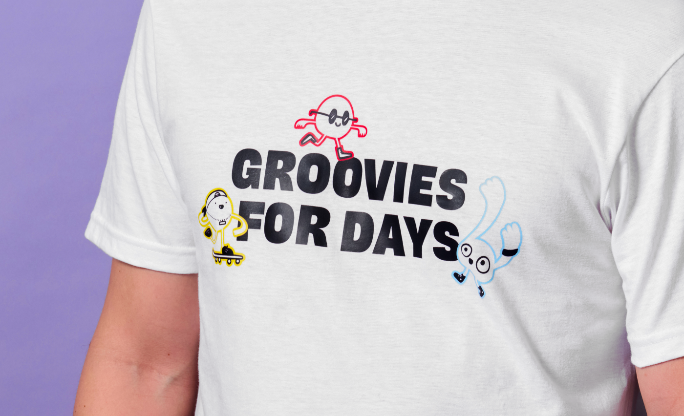
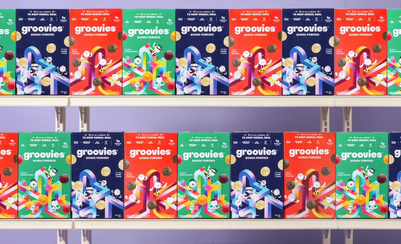
The wordmark is bold yet whimsical, which goes along the core values of the Groovies brand. Along with it, we designed the Groovie Gang. A fun and quirky group of cute illustrations. Each member of the Groovie Gang is always up to something new, inviting anyone who eats Groovies to try something new and exciting everyday.
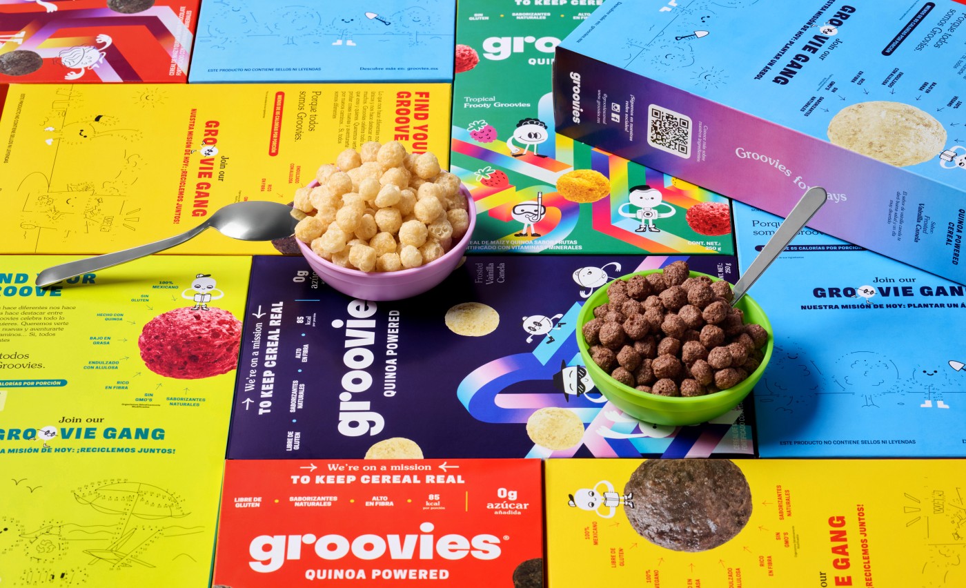
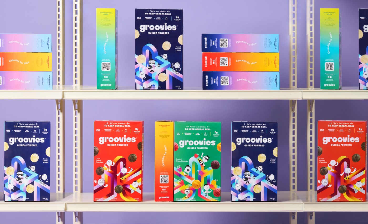
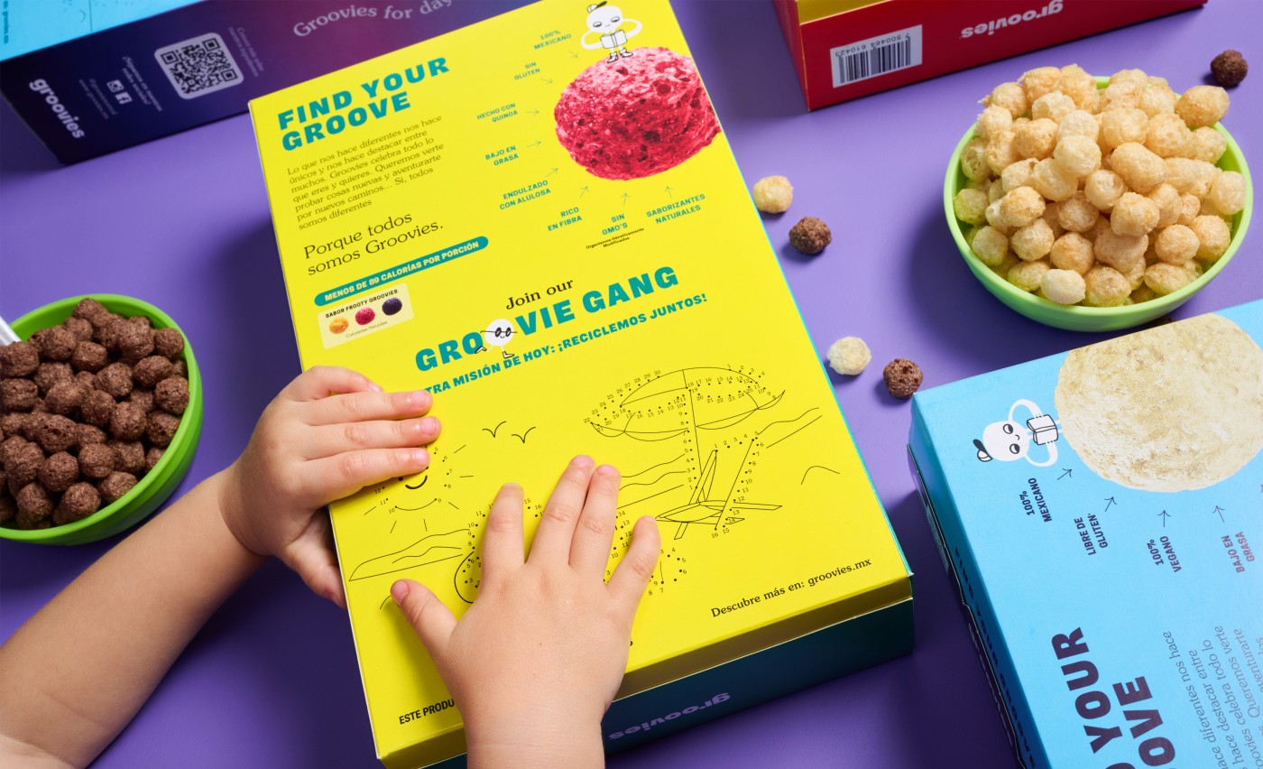
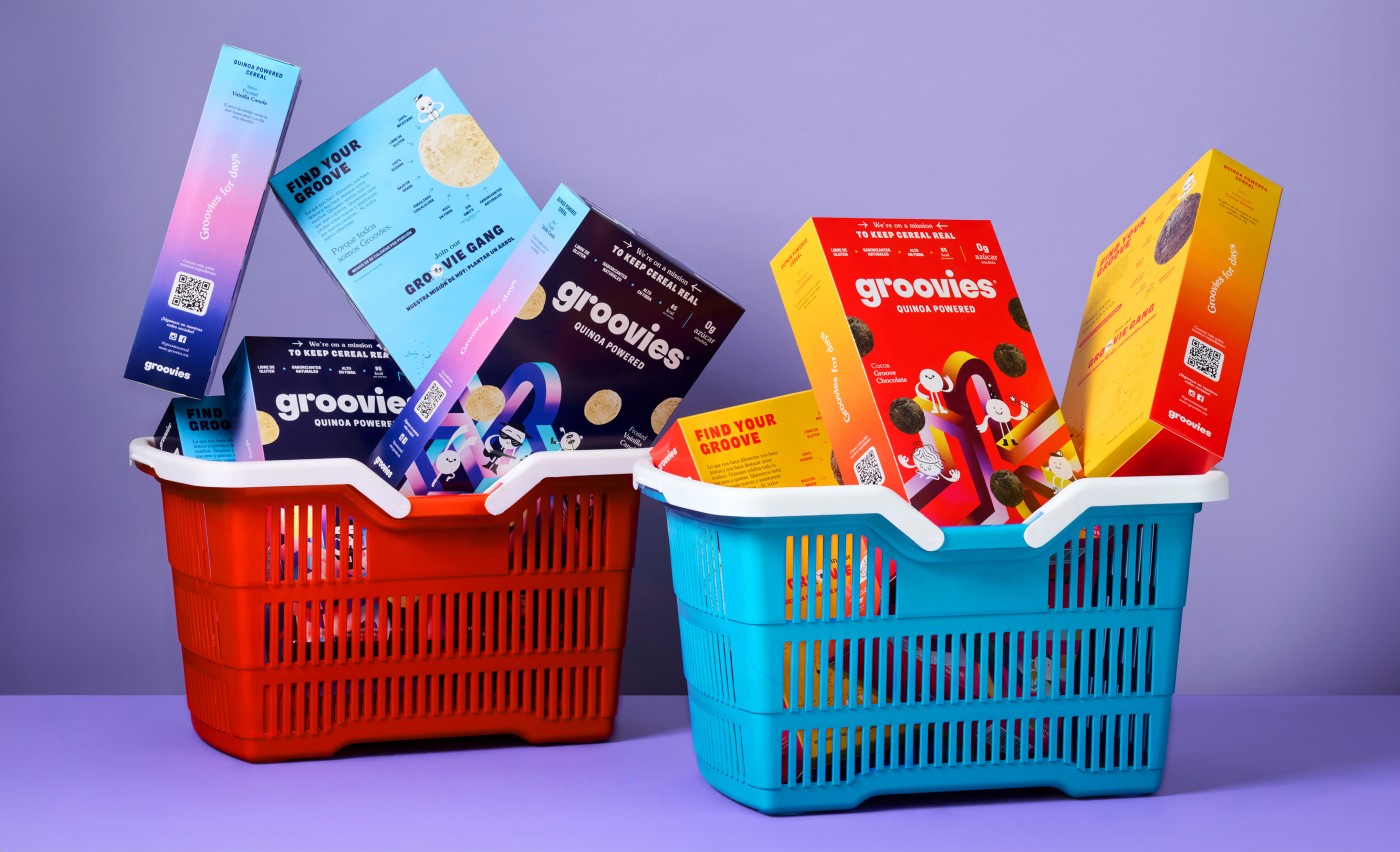
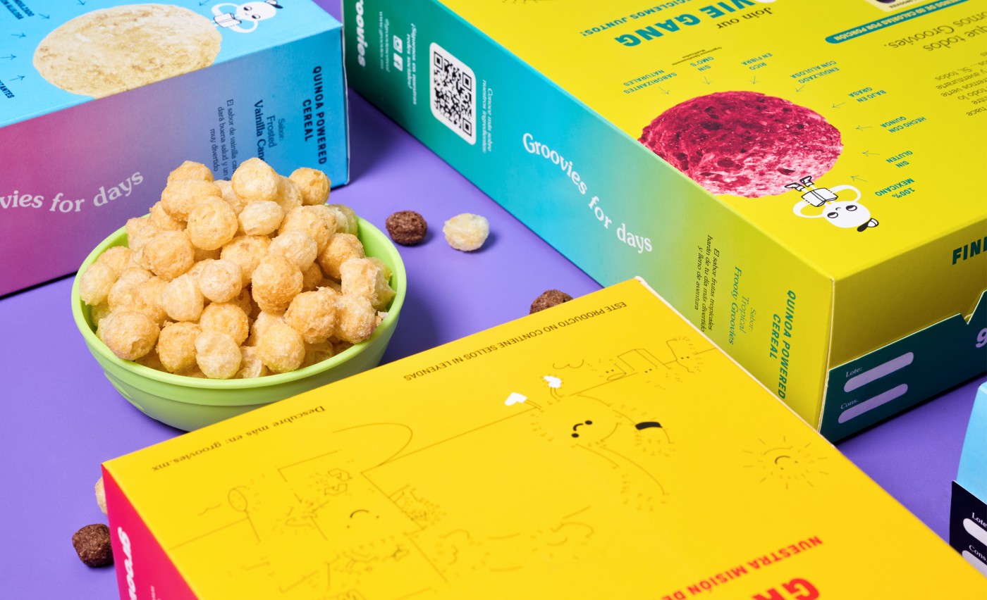
The box features a gradient maze where the Groovie Gang hangs around. Each flavor is set with its own bright color palette to set them apart. When the elements come together, the packaging design becomes a fun and groovie world where anything is possible.
Credits
Creative: Sofía Carrington
Project Manager: Paulina Robles
Copywriting: Andrea De La Mora Tags Packaging, Copywriting, Brand Identity.
Project Manager: Paulina Robles
Copywriting: Andrea De La Mora Tags Packaging, Copywriting, Brand Identity.
Cliente: Groovies
Work:
Food & Drink
