Elcaba
Brand Strategy, Identity, Logotype
Tu pones las cosas, nosotros el espacio
The Brief
Elcaba is a personal storage unit that helps you get your own space and life into shape. Today we live with countless objects that help us make life easier. The problem is these objects just keep coming and sooner than later we find ourselves hoarding our possessions that take up our space.
Sure, you can throw them away, but Elcaba knows there are some things you're just not ready to let go of yet. For those objects we need and love so much, there's a perfect storage unit waiting for them. The best part is, you can visit them anytime and use them whenever you want without putting your own space on the line.
Sure, you can throw them away, but Elcaba knows there are some things you're just not ready to let go of yet. For those objects we need and love so much, there's a perfect storage unit waiting for them. The best part is, you can visit them anytime and use them whenever you want without putting your own space on the line.
The Solution
We created a mark getting our inspiration from the purpose of the business and our clients, too.
The mark is constructed with the idea of boxes being piled up in storage units.
Within the mark, the three green-filled boxes represent each of the 3 sisters that own the business. The three-dimensional feeling creates an iconic symbol that can work alone or with the wordmark.
We wanted an element that would tie all of the others together.
Something that would make people recognize Elcaba without even seeing the logo.
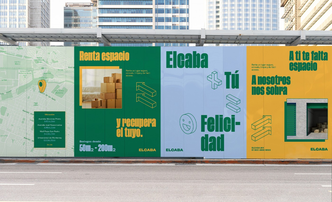
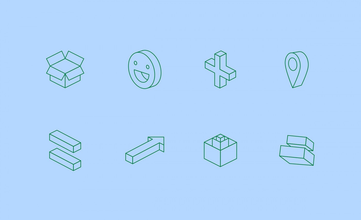
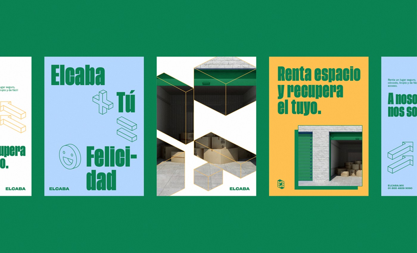
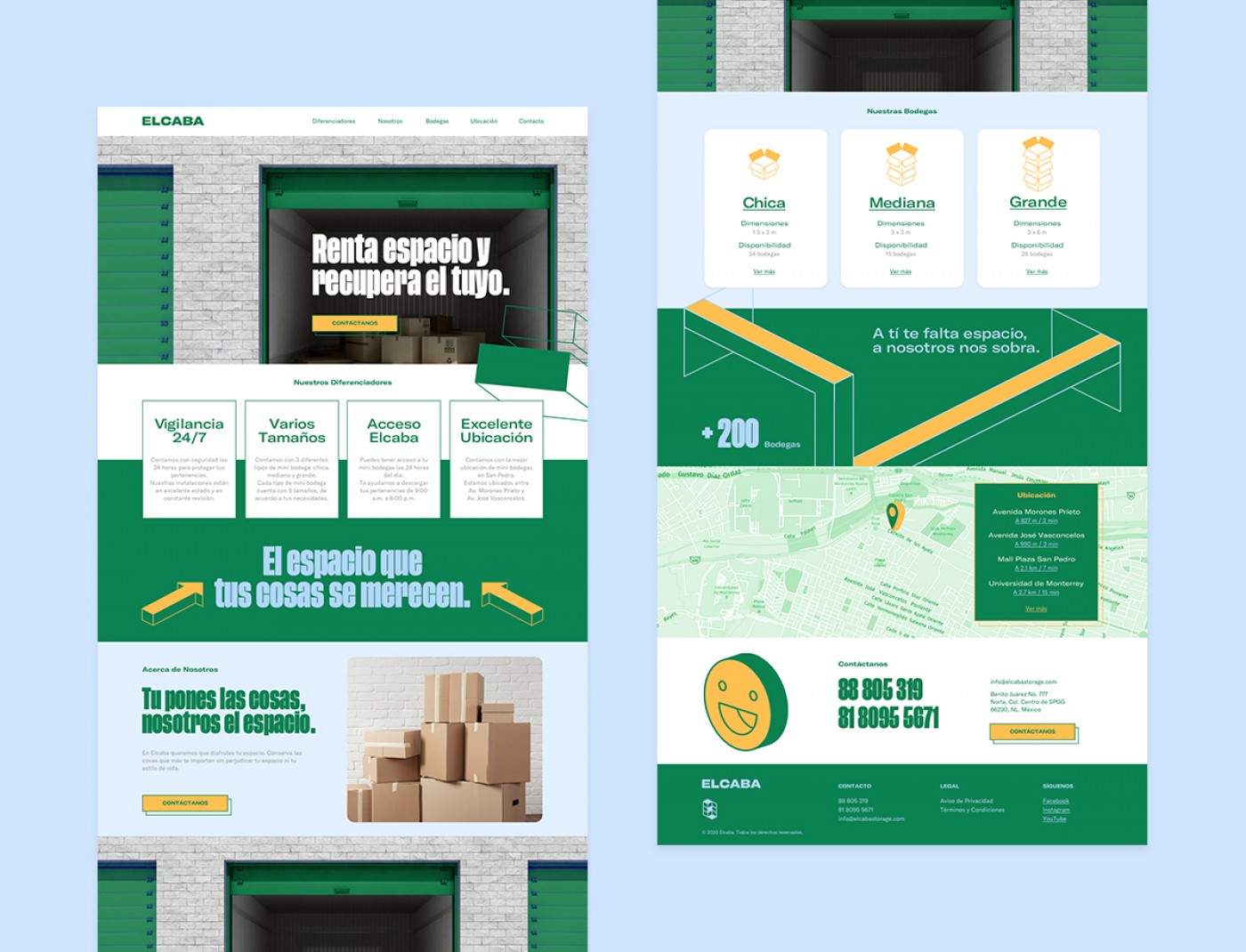
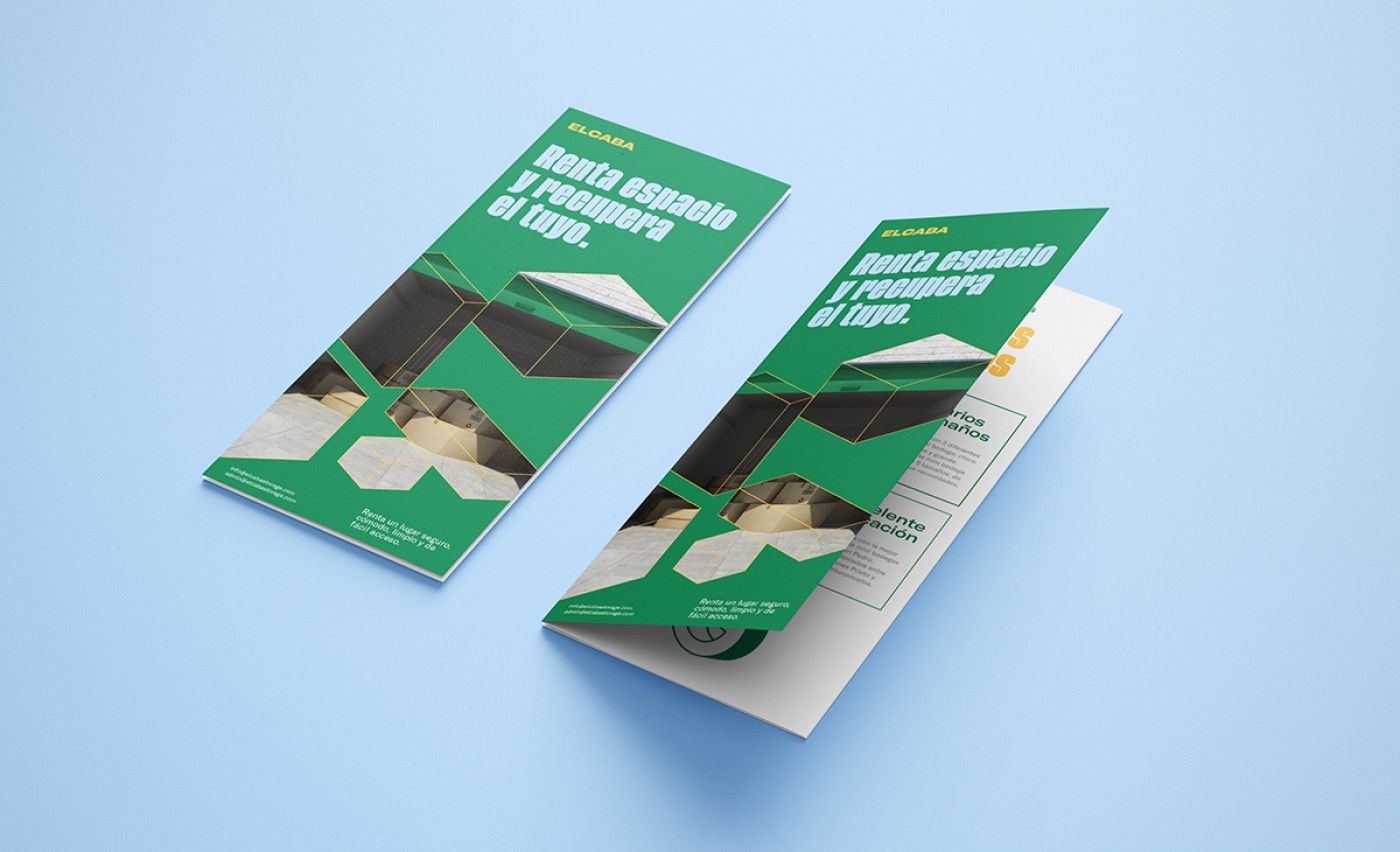
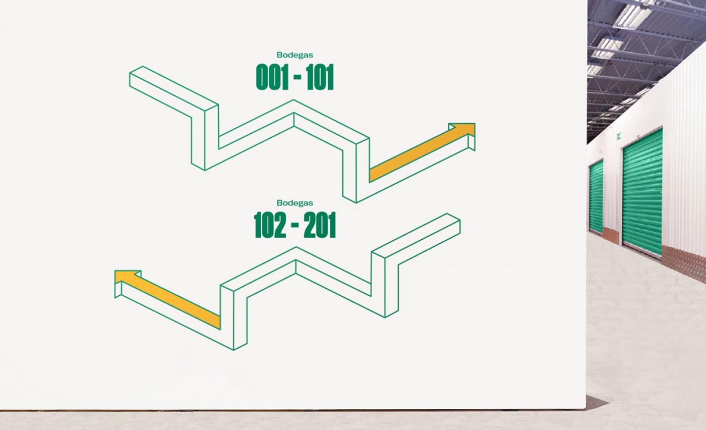
Within that 3D aesthetic, we designed a modular pattern that really rounds up the whole brand.
The pattern gives the brand versatility, edginess and it's a lot of fun.
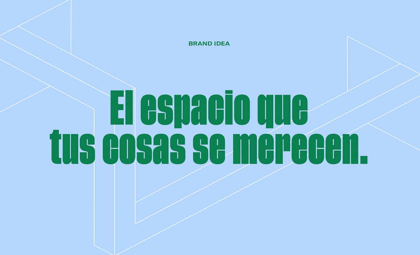
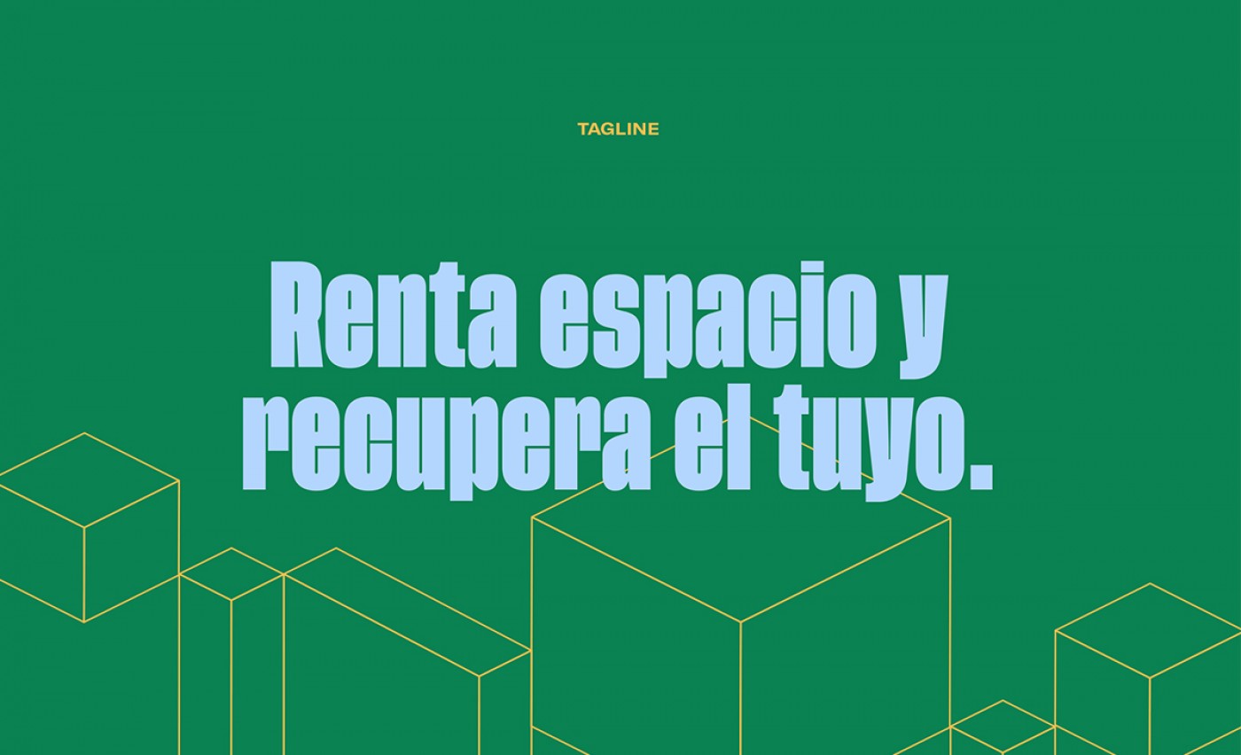
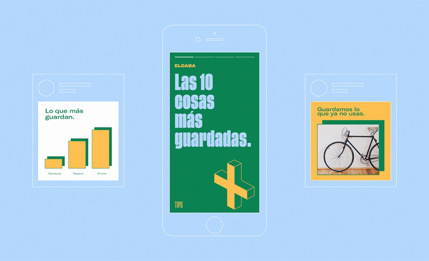
We created a tagline that would communicate exactly how straight forward the storage business can be and that gives people what they want. Rent a space and take back yours. Following the tagline, we worked on creating a sharp voice that delivers the message clearly. We created a casual yet direct voice that talks about all the good things that come from using private storage. We also created a content plan that would help followers learn about how their life could be better if they just used Elcaba.
Credits
Tags
Storage, Space, Identity
Cliente:
Work:
Consumer
