Albural
Branding, Logotype, Print
One of the largest pecan orchards being built in México
The Brief
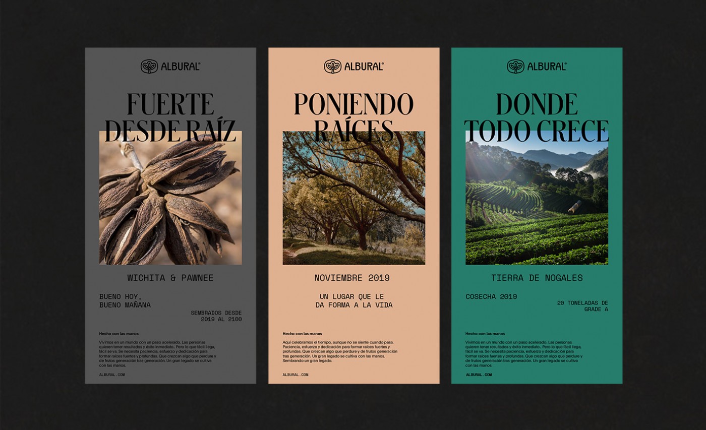
Albural knows the best things in life take time. The orchard was built from the ground up by a family with strong values and a stronger work ethic. As part of their family legacy, Albural is meant to last through many generations, so we had to create a brand that would endure with it.
The Solution
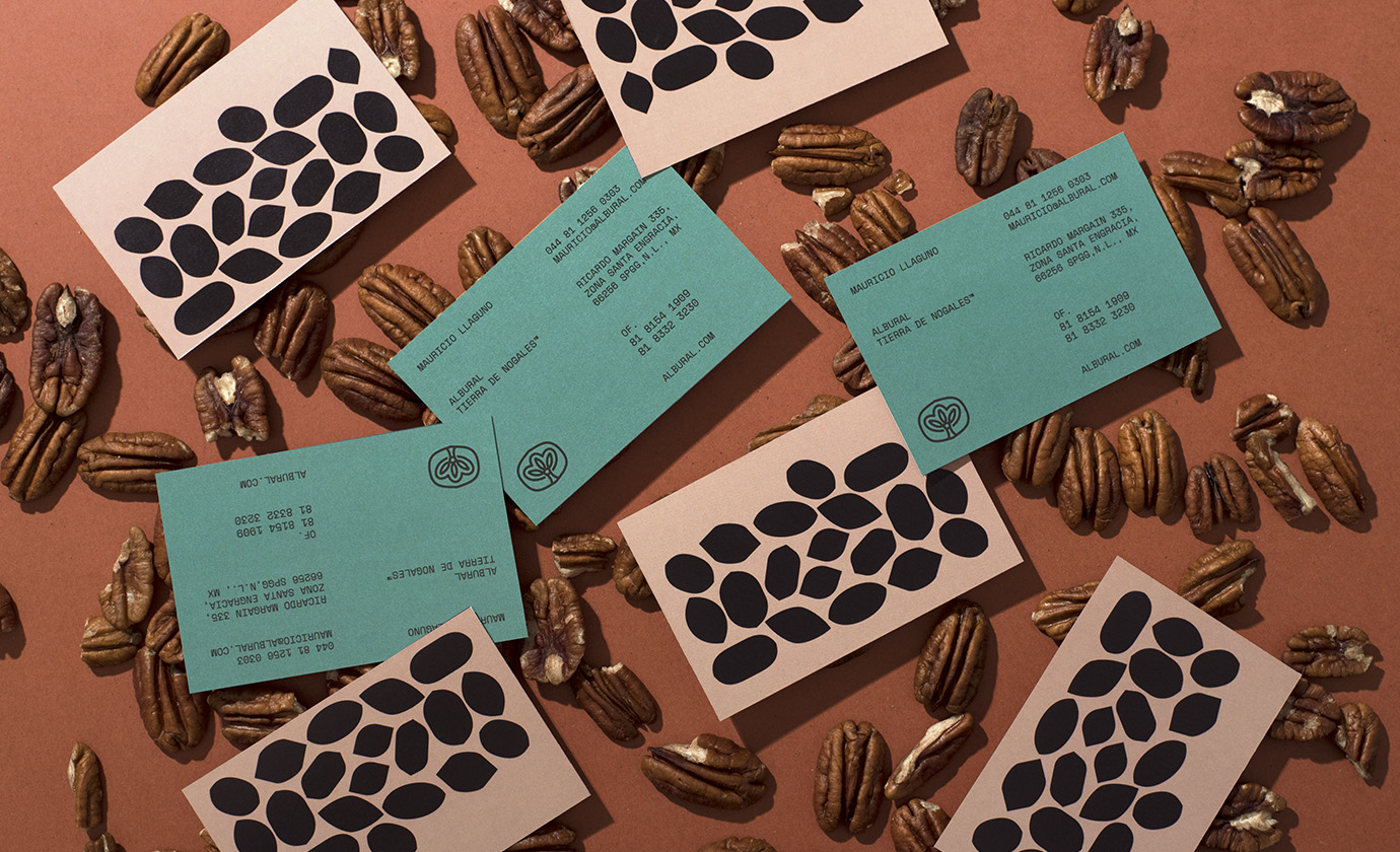
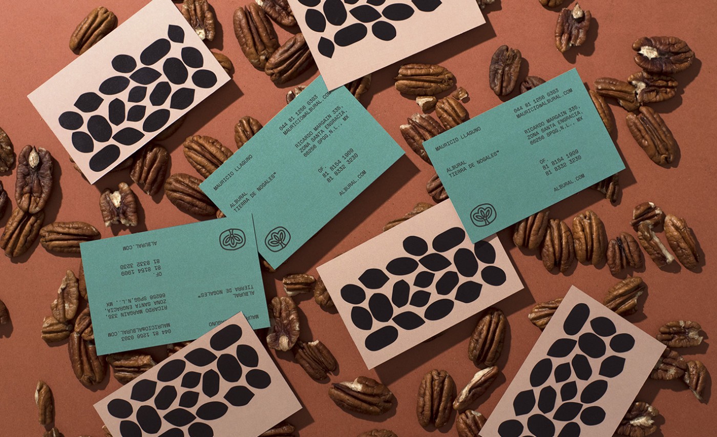
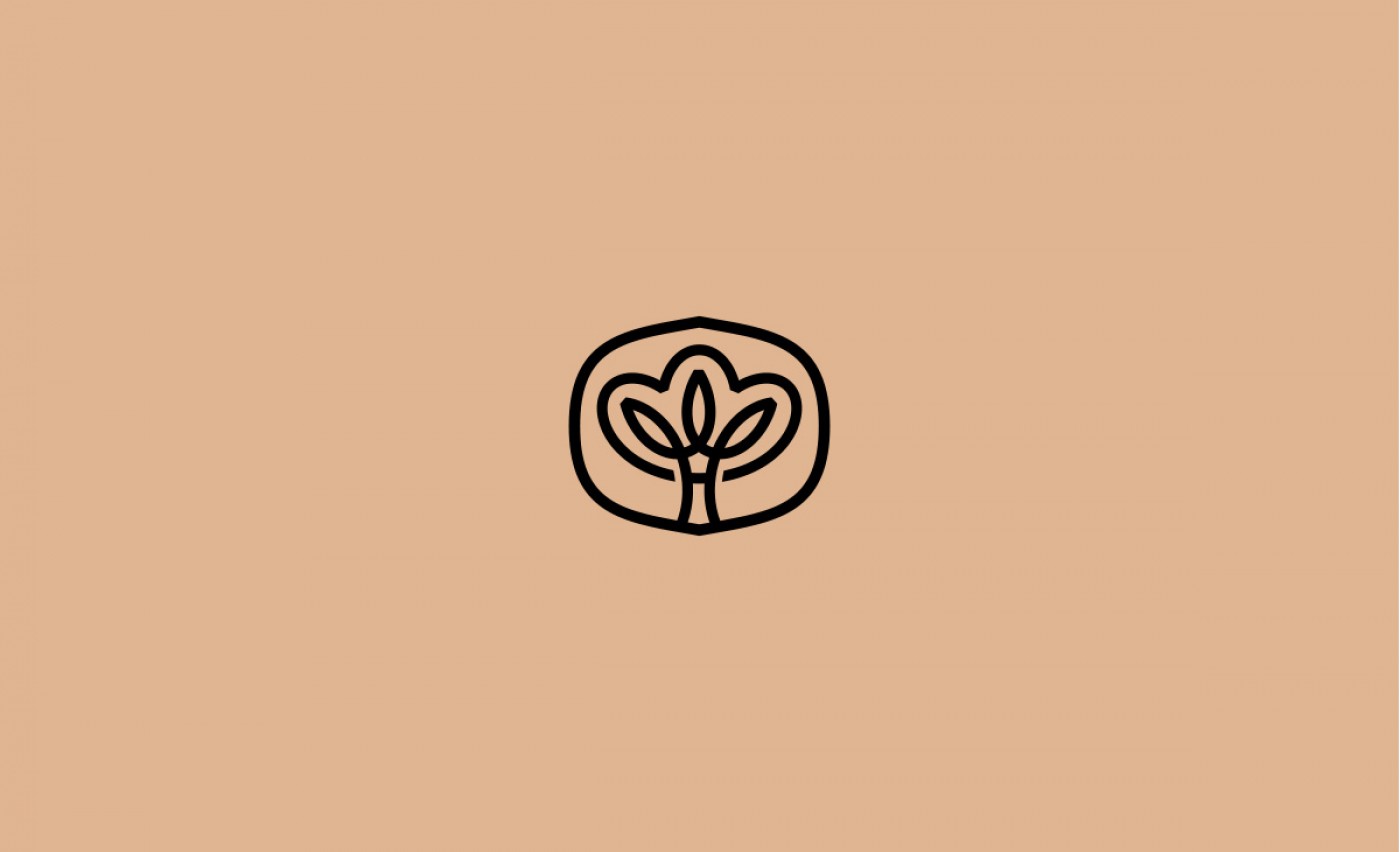
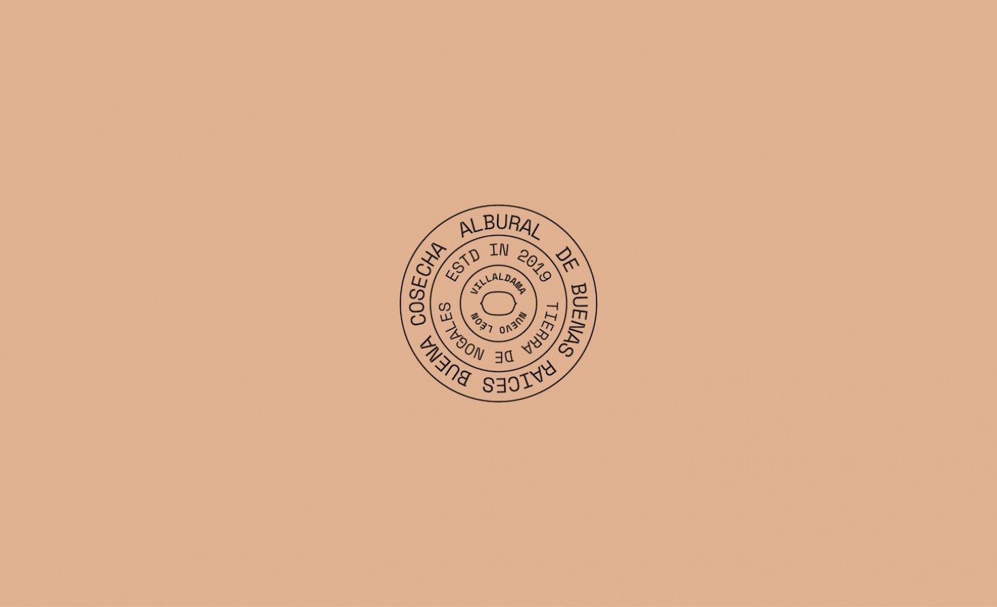
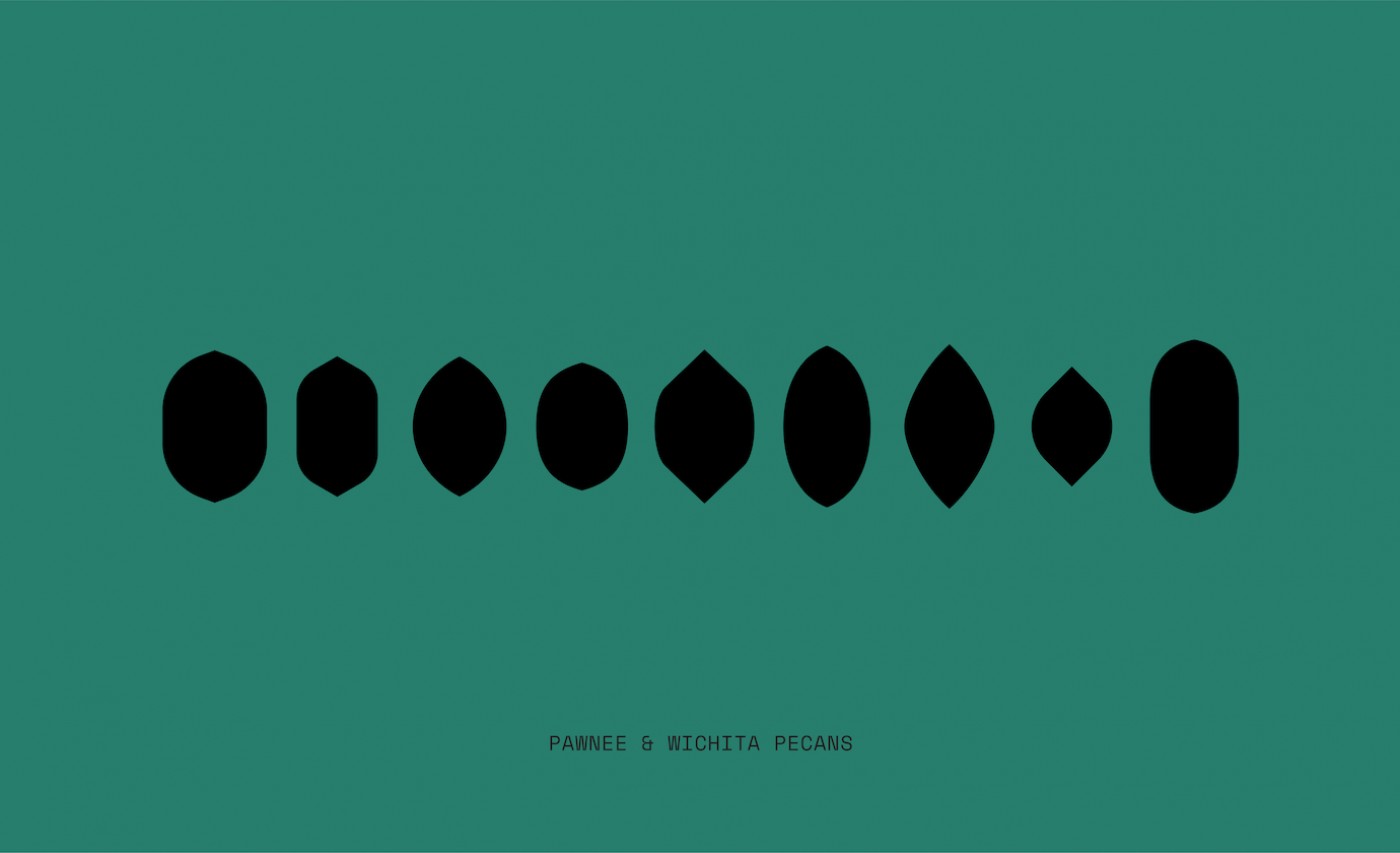
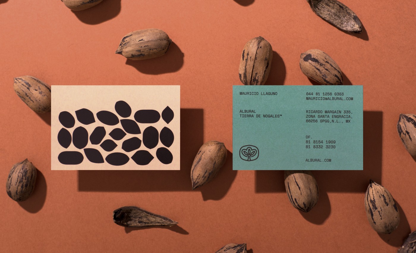
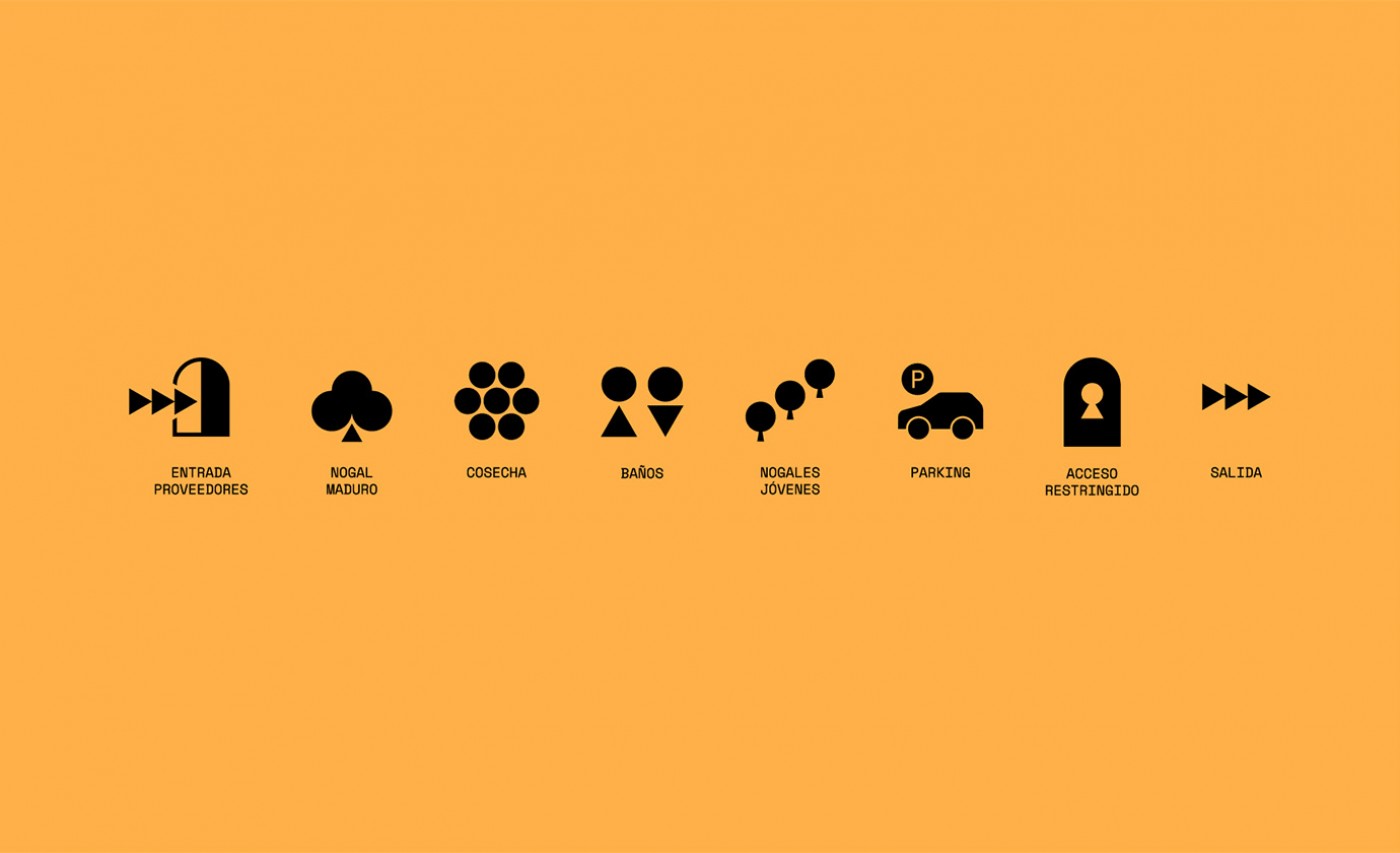
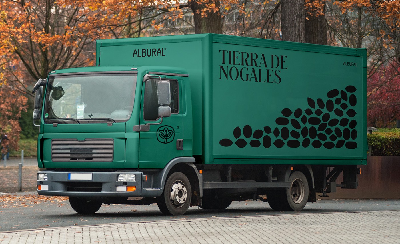
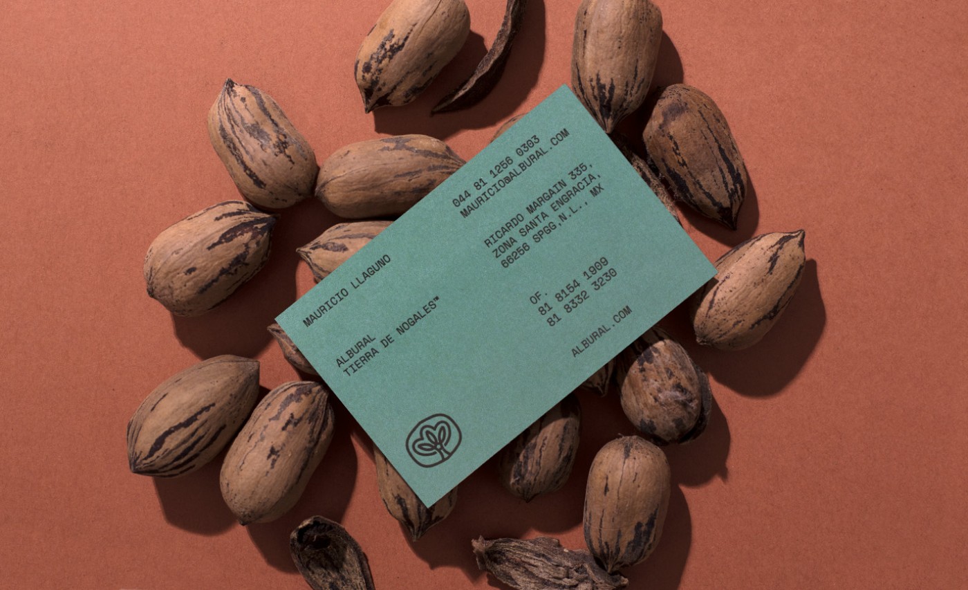
The family is a central concept in the identity, which is why the brand mark serves as a symbol for both the family tree and the Pecan trees within the orchard. We created different patterns inspired by the different shapes of the pecan shells, which assemble in “stacks” to give the brand a playful and lighter feel. The result is a strong and timeless brand with unique visual system, that communicates the story of a strong family and would serve as the start of a great legacy.
Credits
Creative Director: Manuel llaguno
Project Manager: Paulina Zaragoza
Copywriting: Andrea de la Mora Tags Pecan, Nature, Branding, Concept,
Project Manager: Paulina Zaragoza
Copywriting: Andrea de la Mora Tags Pecan, Nature, Branding, Concept,



Cliente: Albural
Work:
Food & Drink
