Nexxus
Branding, Identity, Website Design
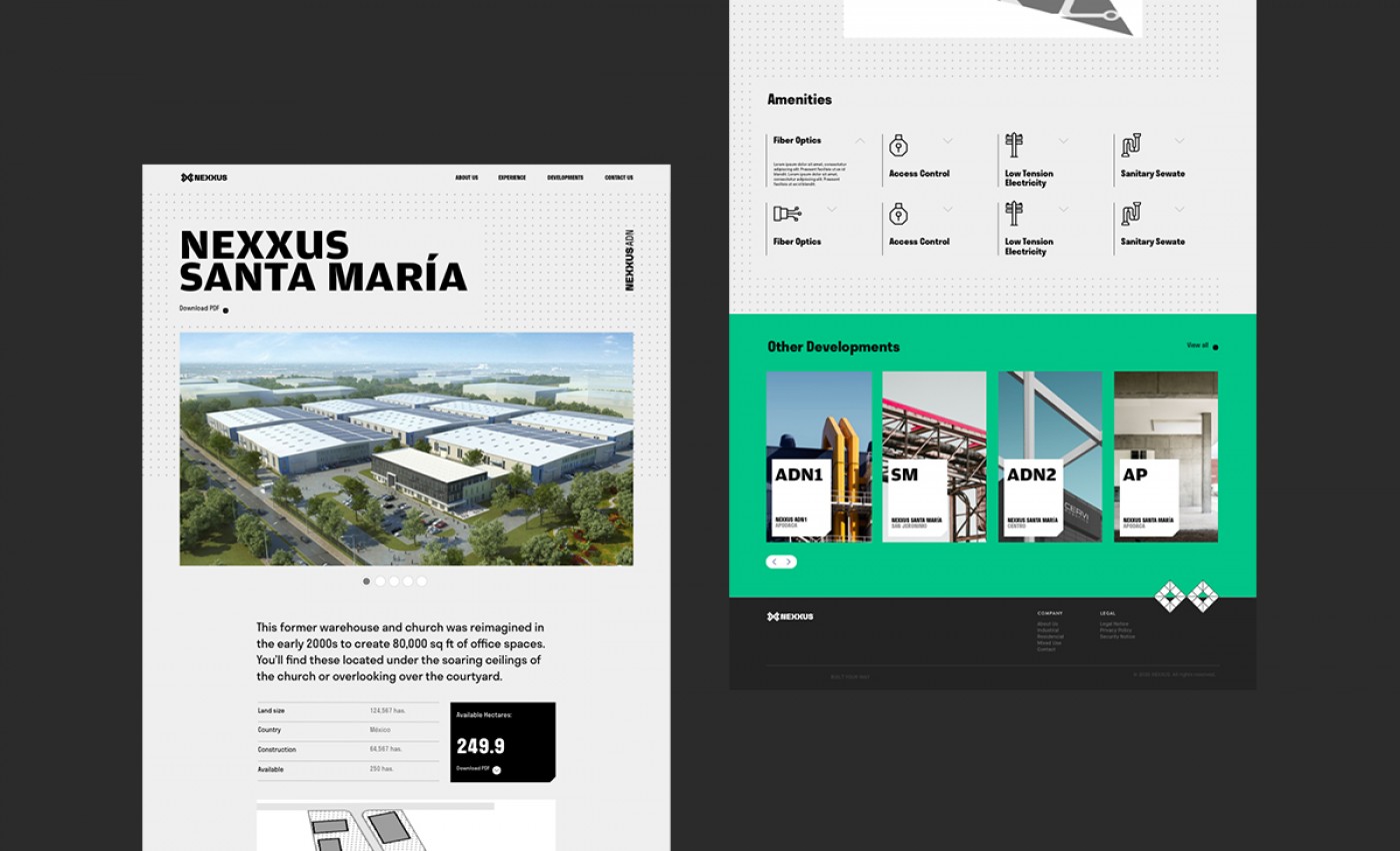
Nexxus is an Industrial Real Estate developer that custom-builds move-in-ready industrial warehouses for the world's most ambitious enterprises.
The Brief
Nexxus takes pride in being the most detailed and accommodating business partner that helps your company find its home. When designing the brand, we wanted to give them the strength and importance that they have earned as a company. We were inspired by their process and problem-solving skills to create a brand that reflected their success.
Overall, the rebrand sets Nexxus as the partner you trust to make your industrial dreams come true. From scouting the perfect land to tailor-making a warehouse to your needs, Nexxus is the connection for success.
Overall, the rebrand sets Nexxus as the partner you trust to make your industrial dreams come true. From scouting the perfect land to tailor-making a warehouse to your needs, Nexxus is the connection for success.
The Solution
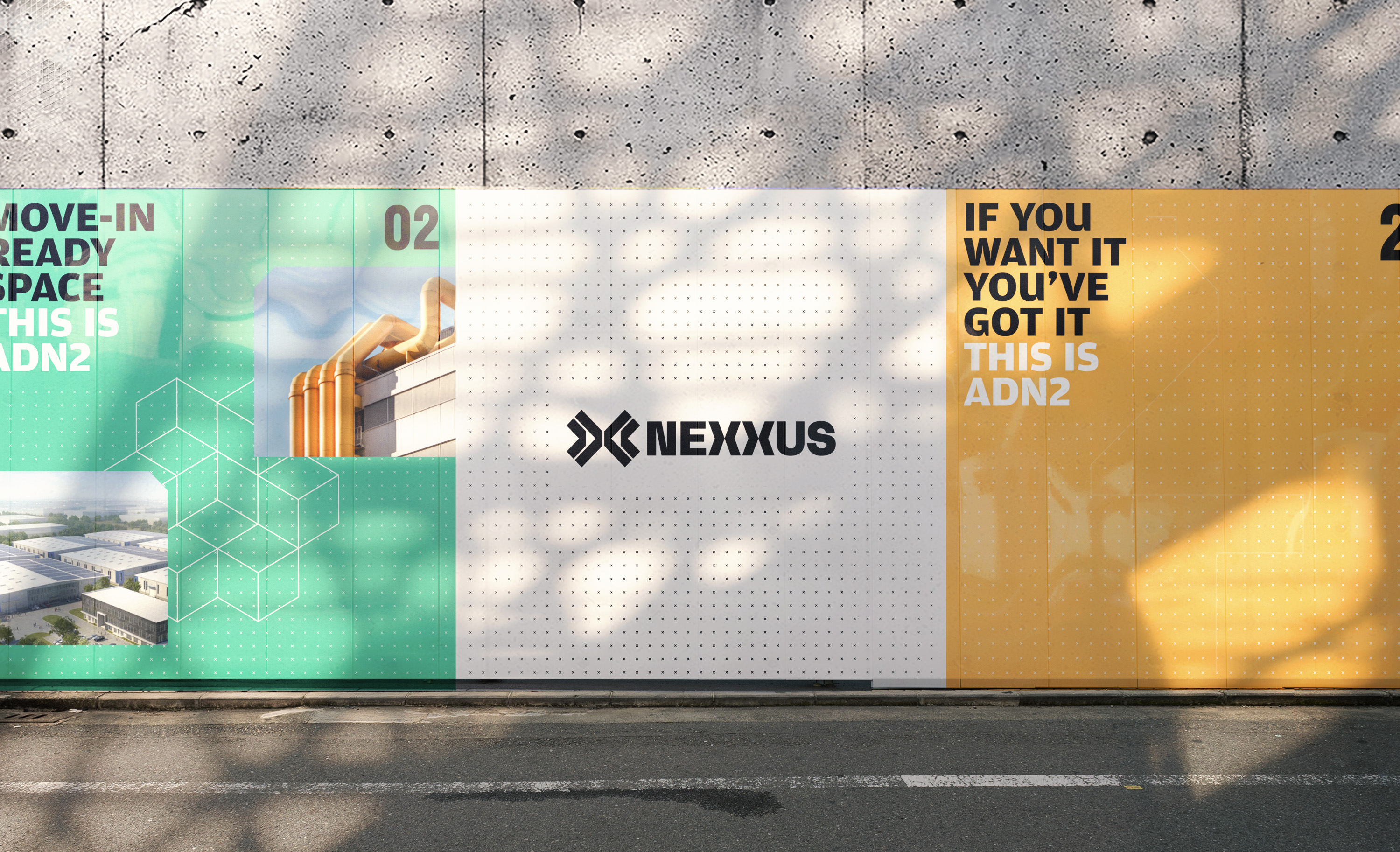
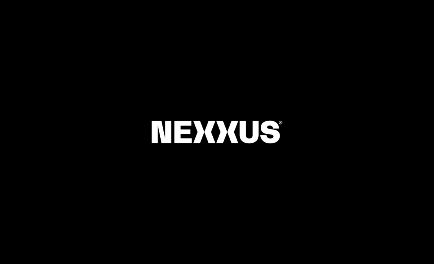
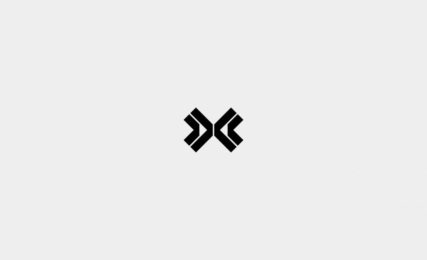
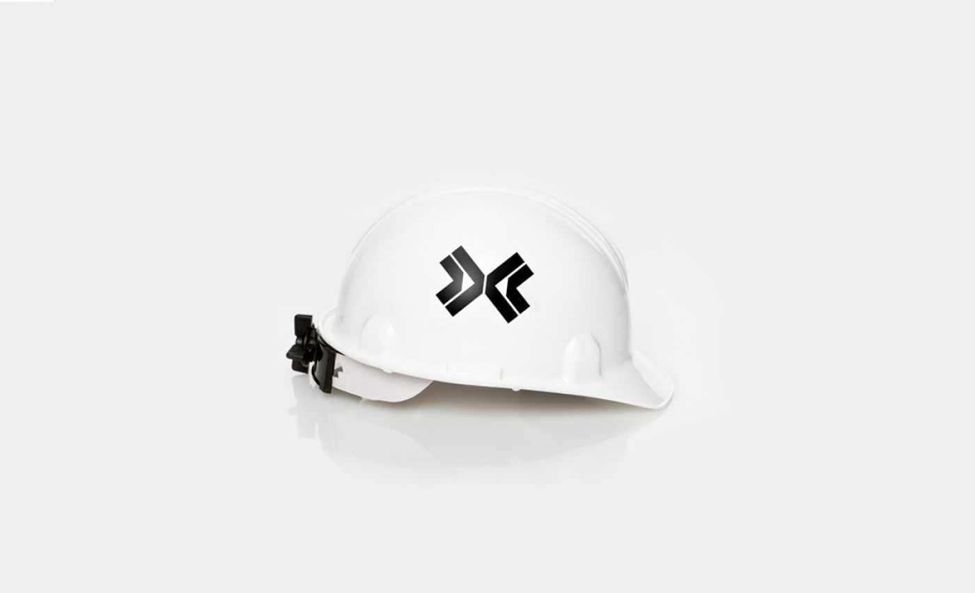
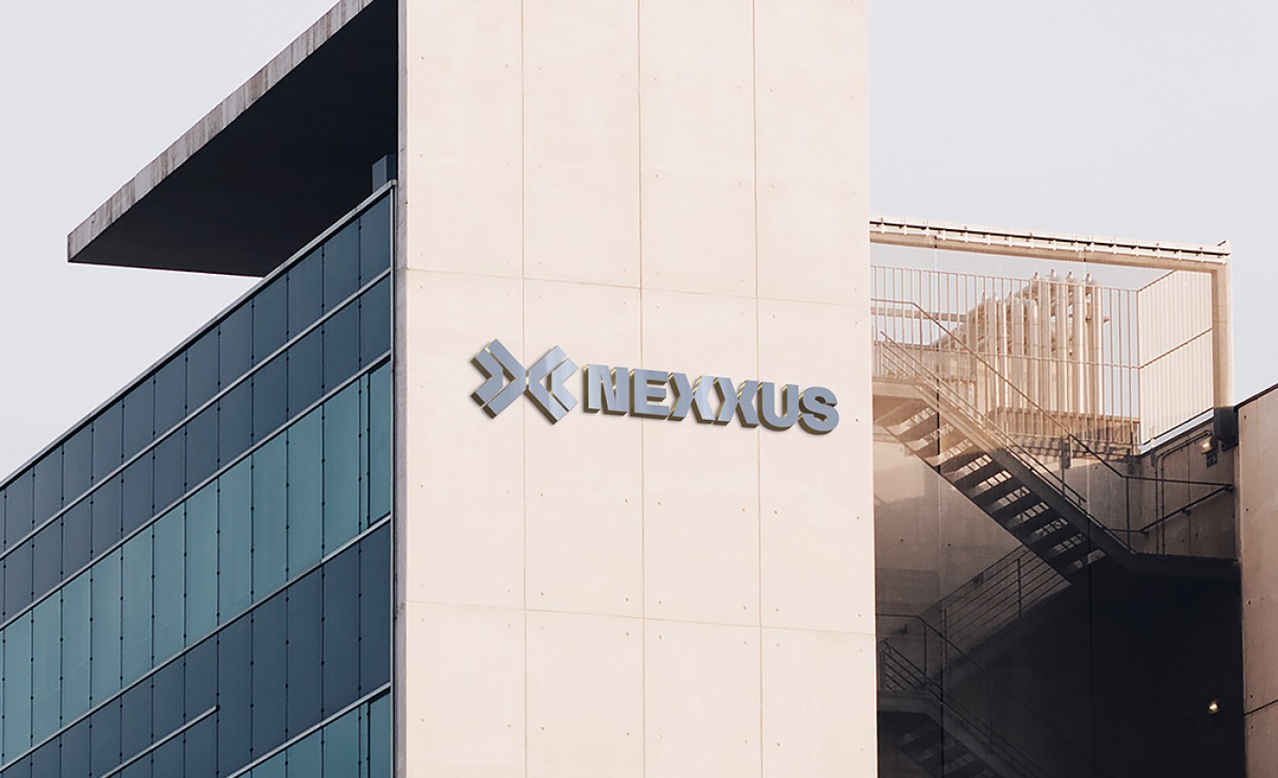
We designed the brand mark to reflect Nexxus' strength and distinction. We went for a more structural approach creating a symbol from the iconic double Xs on Nexxus' name. Adding a bigger X that connects the latter, we embraced the concept of Nexxus being the connection between your enterprise and its success. In the end, we created a strong mark that will be an icon of their skills and abilities.
Nexxus is a company that knows where they come from and where they are going.
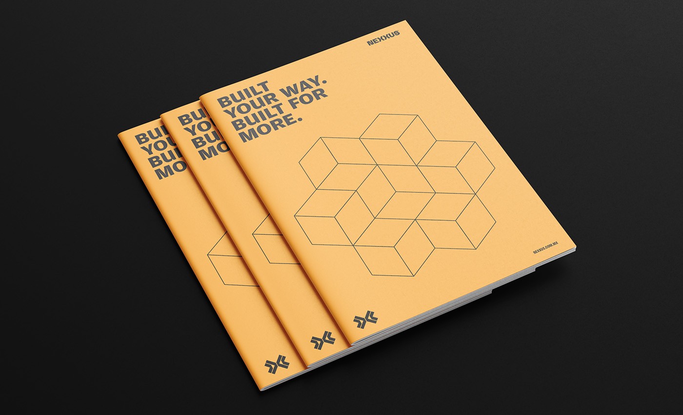
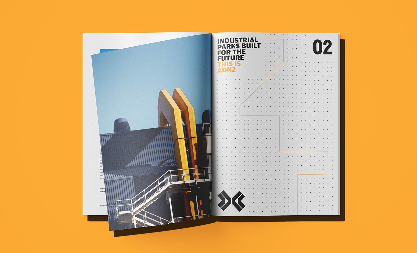
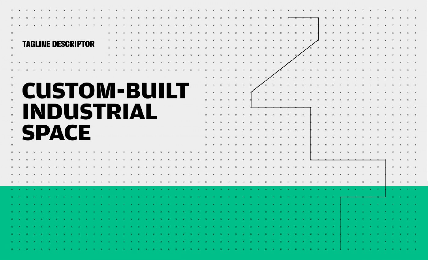
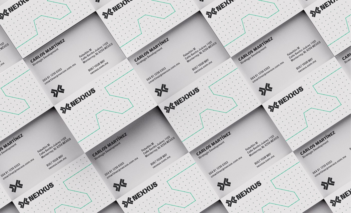
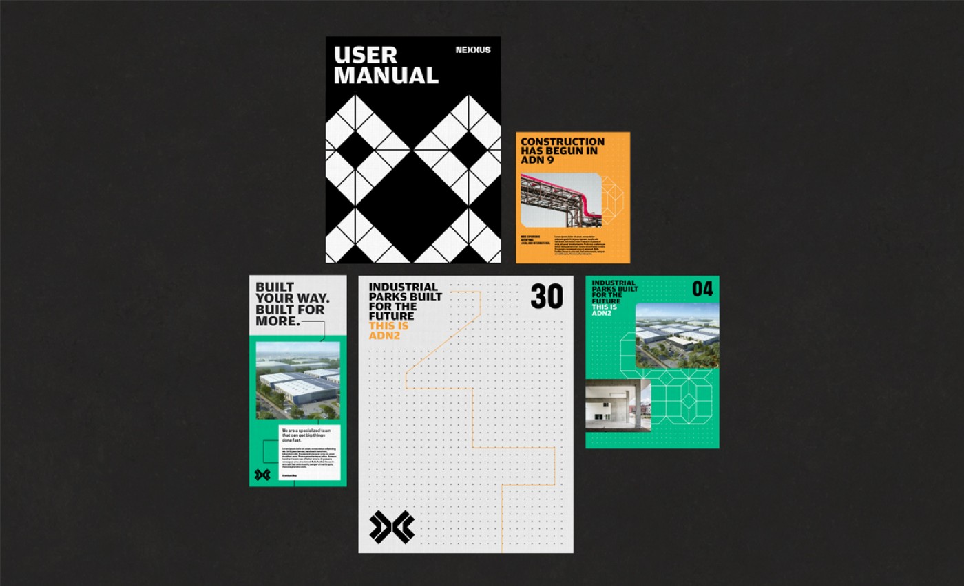
Centering on this idea of pathways, we created a modular system that gives the brand versatility while staying true to the concept. These lines can be used in various directions to accommodate each brand application and make Nexxus that much more recognizable and established.
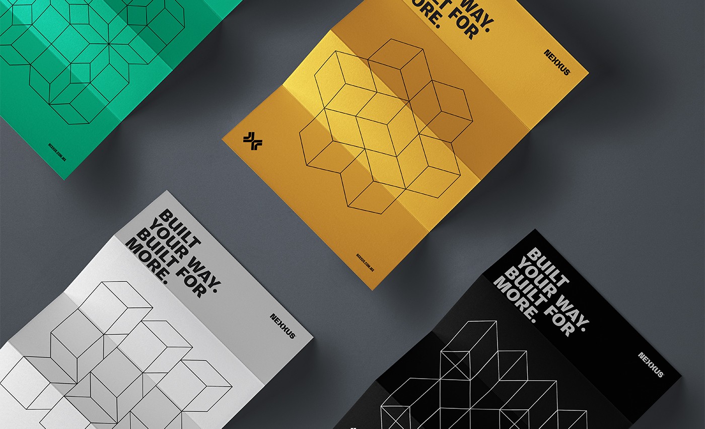
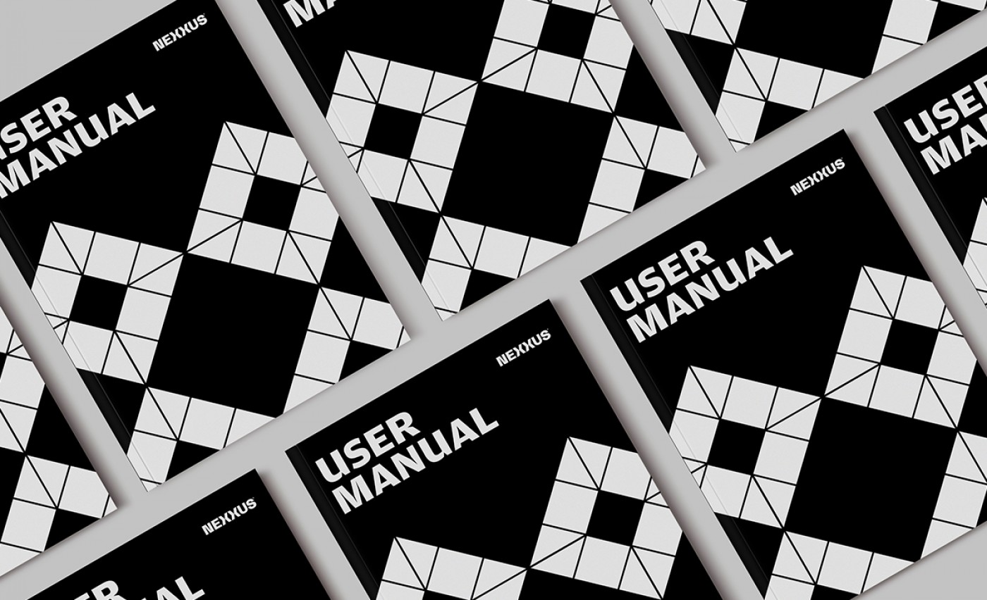
We created a set of structural patterns and formations to add more personality to the brand system. These patterns exist to be modular and versatile to accommodate any brand use. The Structures are born from the iconic Xs that the mark comes from, but used with more complexity. Every formation is unique and different, just like each Industrial development is made unique for each client.
Credits
Creative: Manuel Llaguno
Copywriting: Andrea De La Mora
Project Manager: Paulina Zaragoza Tags Industrial, Real Estate, UI/UX.
Copywriting: Andrea De La Mora
Project Manager: Paulina Zaragoza Tags Industrial, Real Estate, UI/UX.
Cliente: Nexxus
Work:
Industrial
