Blow
Branding, Copywriting, Packaging
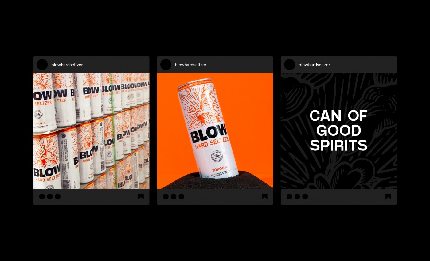
Blow is a bold new hard seltzer that was born with a bang!
The Brief
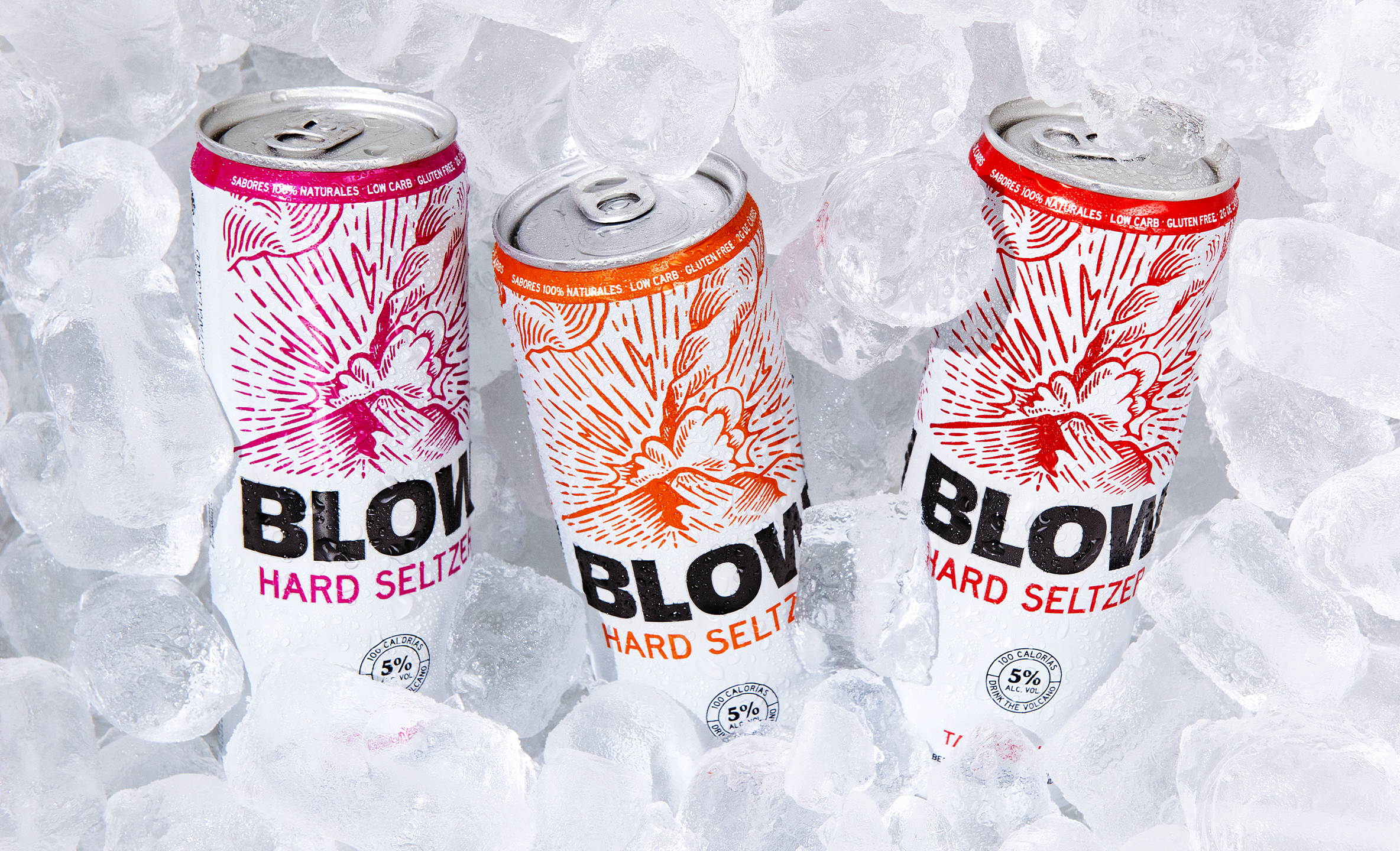
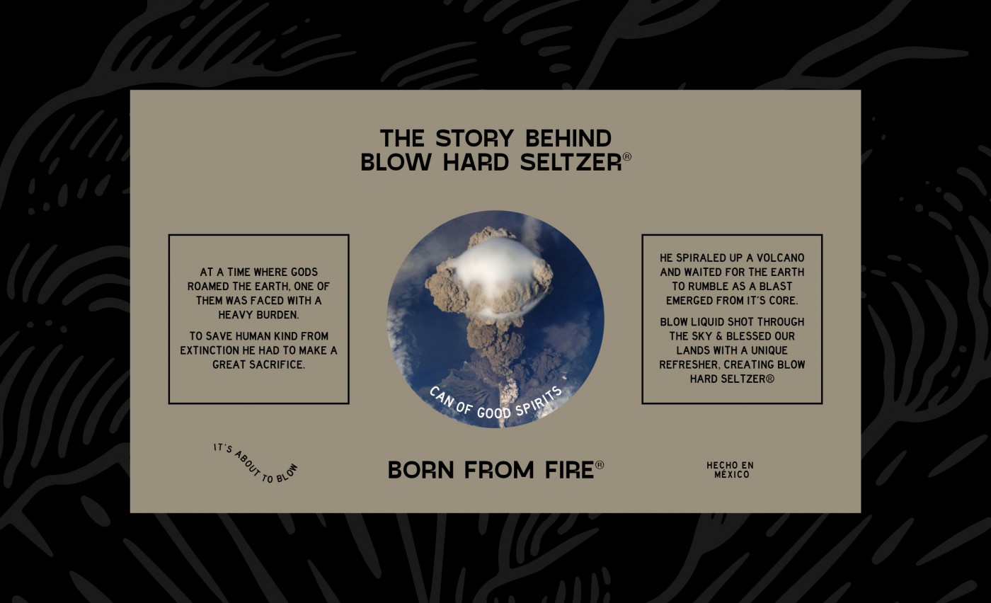
Blow's story is a loud one inspired by the loudest bang ever heard on earth. Legend has it the drink was born from deep inside a volcano that erupted thanks to a God that sacrificed himself for humankind. Now we are blessed with the unique refresher that is Blow Hard Seltzer. This was a brand that was fun to work on. Nowadays, hard seltzers are popping up everywhere, so we had the freedom to create a unique story that would set Blow apart from the rest. The brand itself had to be bold and eye-catching so we got our inspiration from the strength of volcanoes. Overall, Blow is a drink that is hard to ignore and even harder not to love.
The Solution
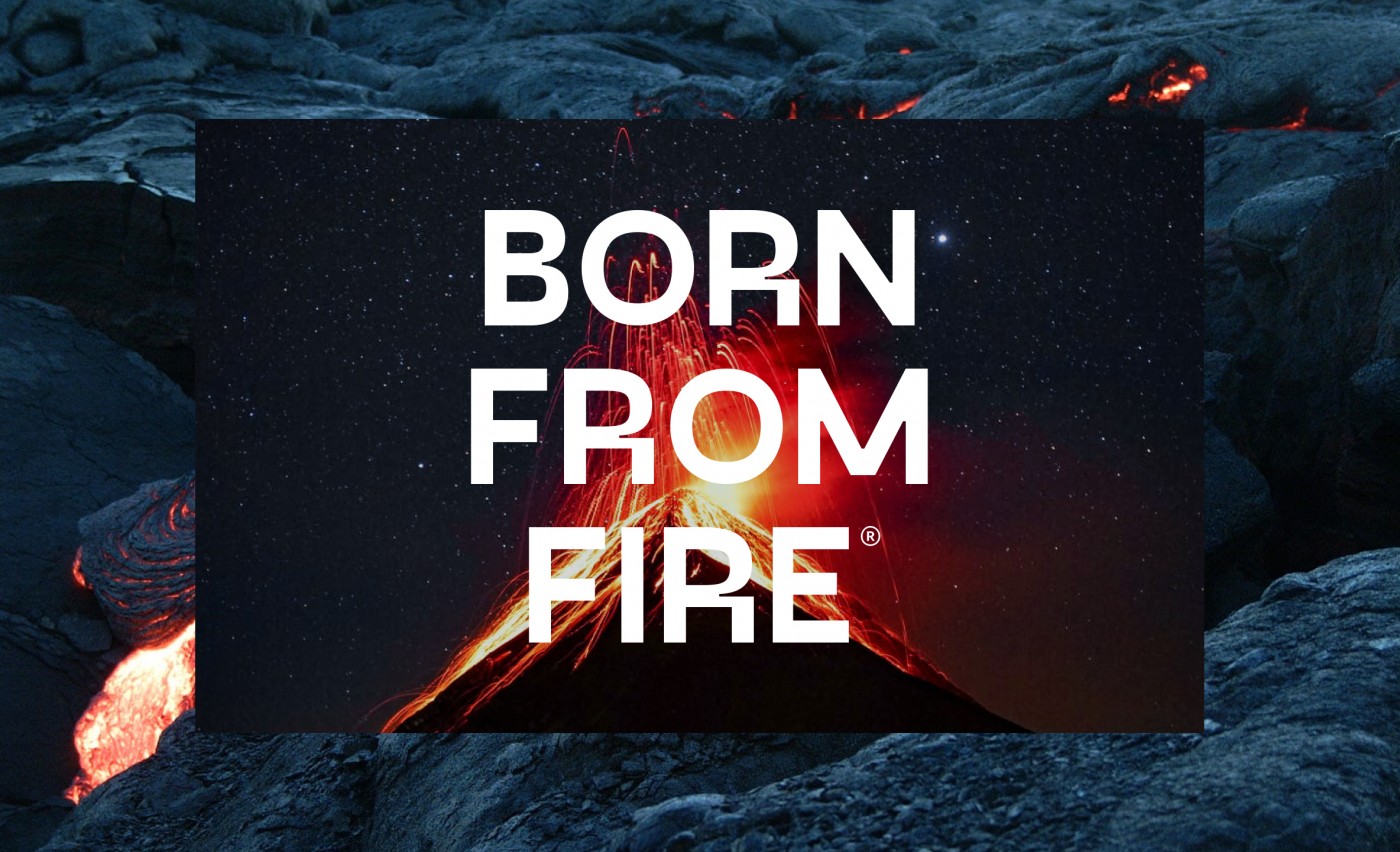
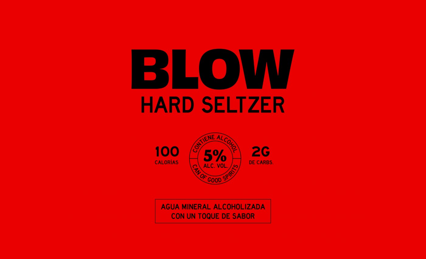
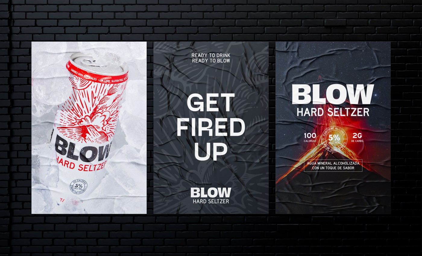
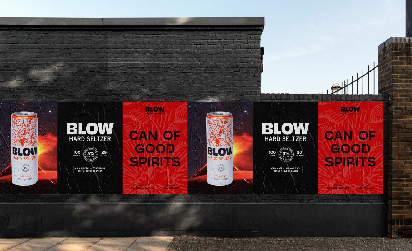
We wanted every aspect of Blow to be extremely bold and audacious. The wordmark we created features the name front and center, loud and clear, so when you're looking for it in an aisle it will be the easiest to find. The tagline "Born from Fire" partners with the logo to send a message of strength and adventure.
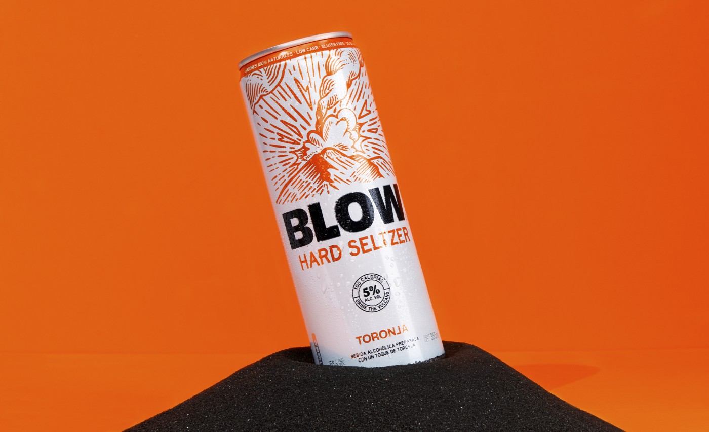
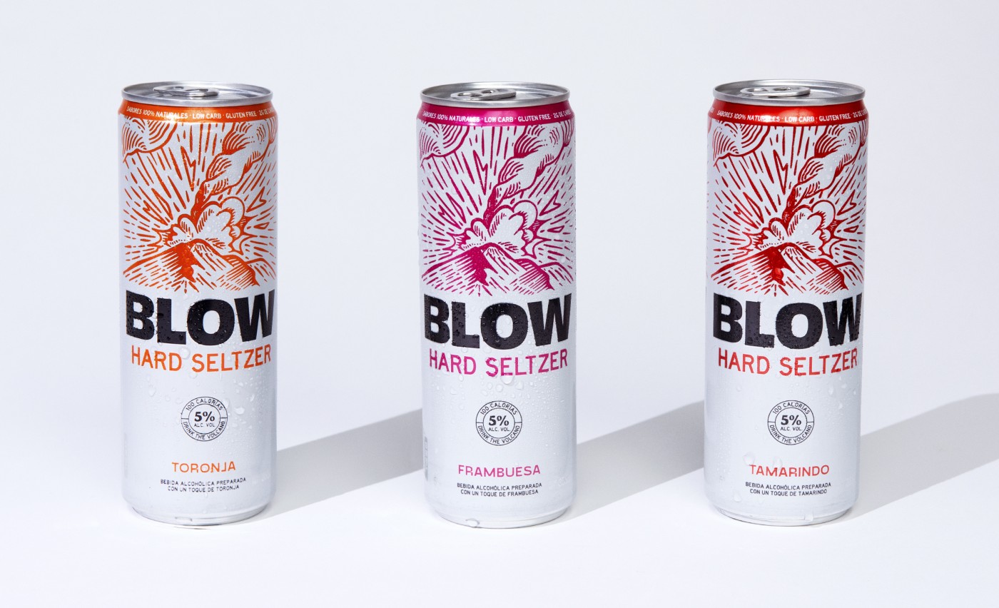
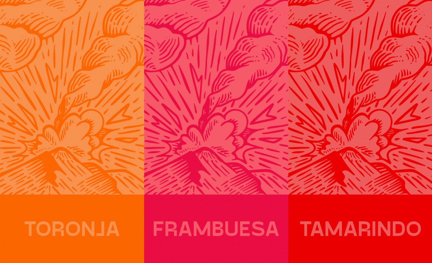
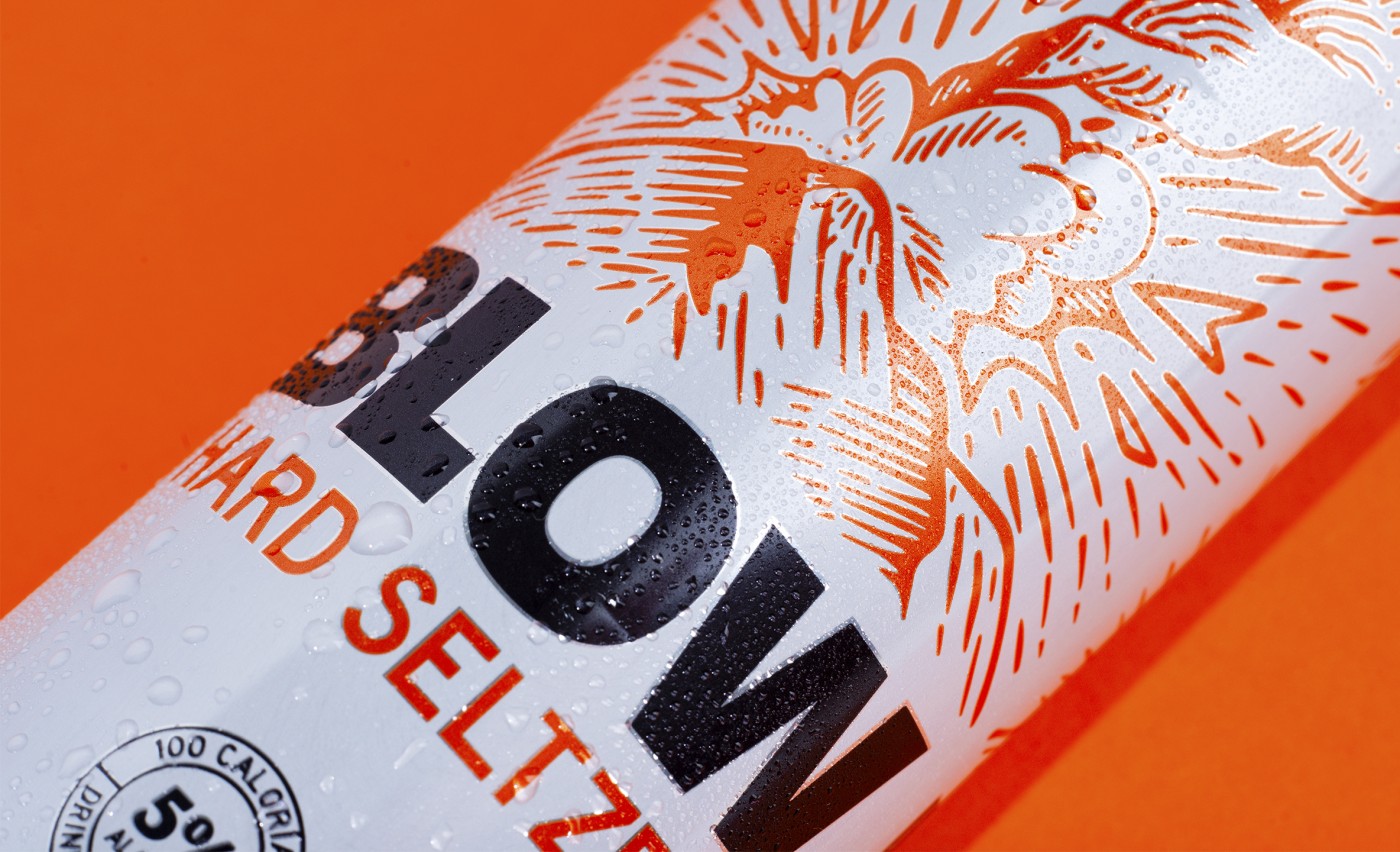
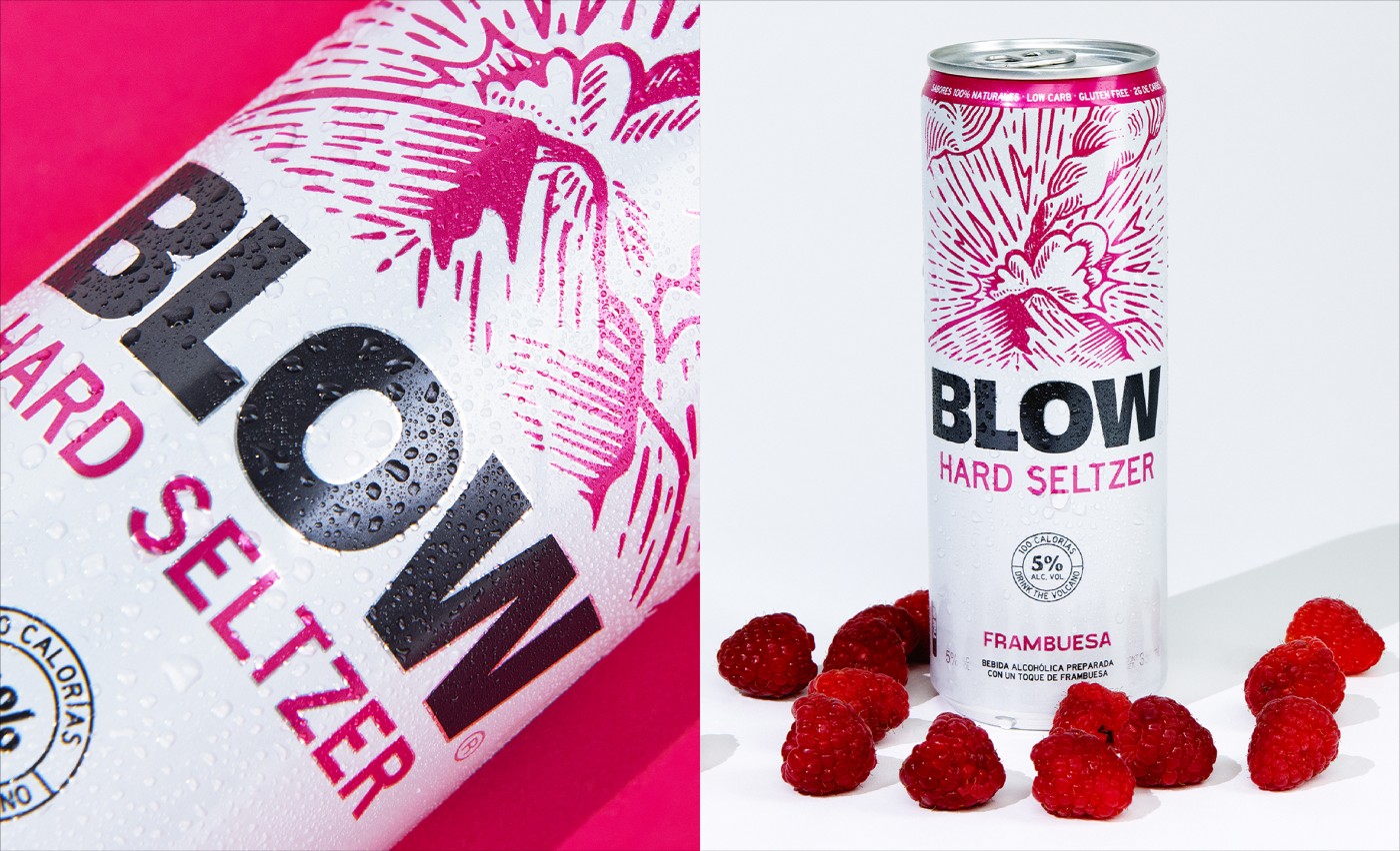
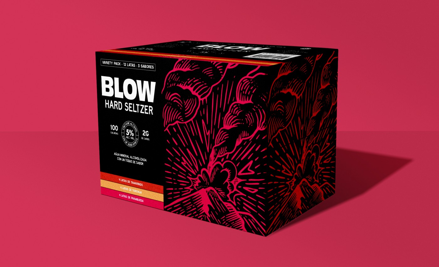
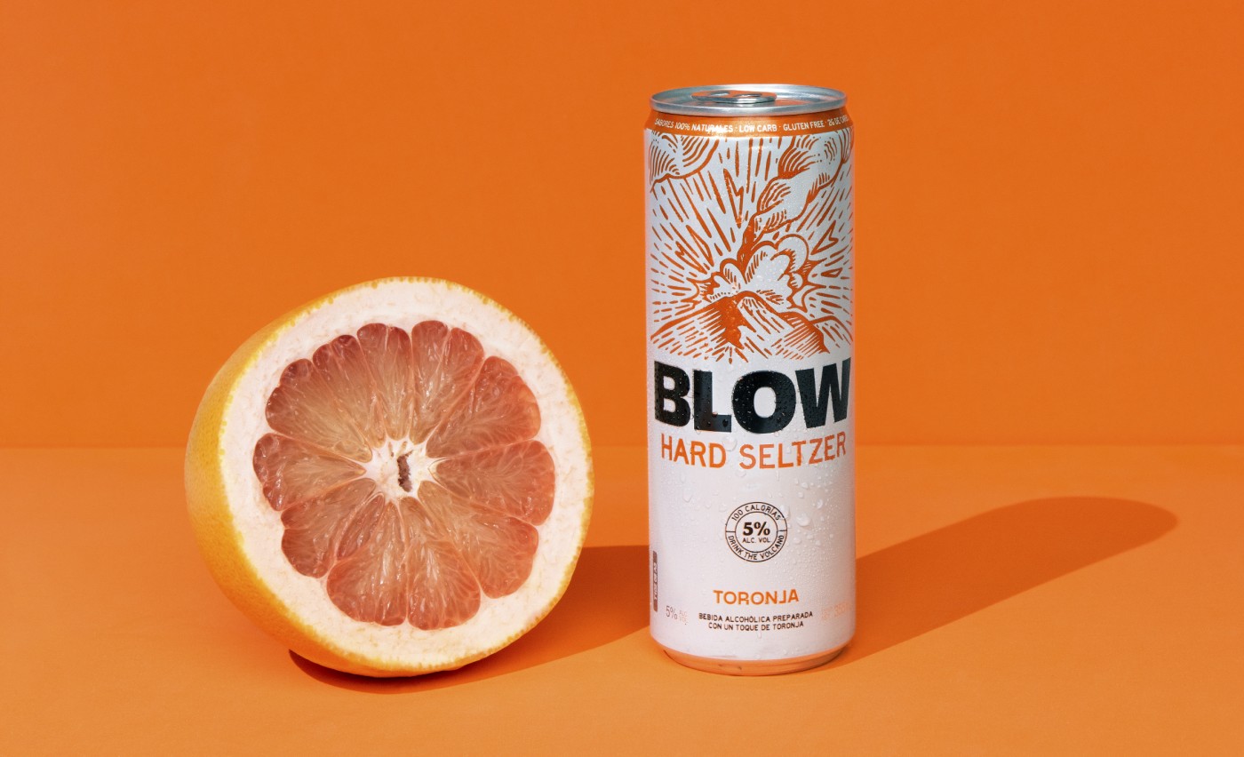
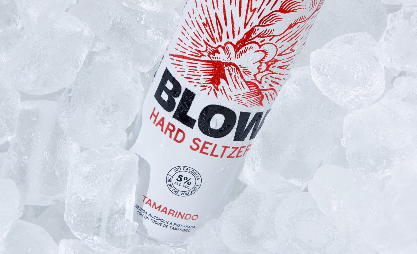
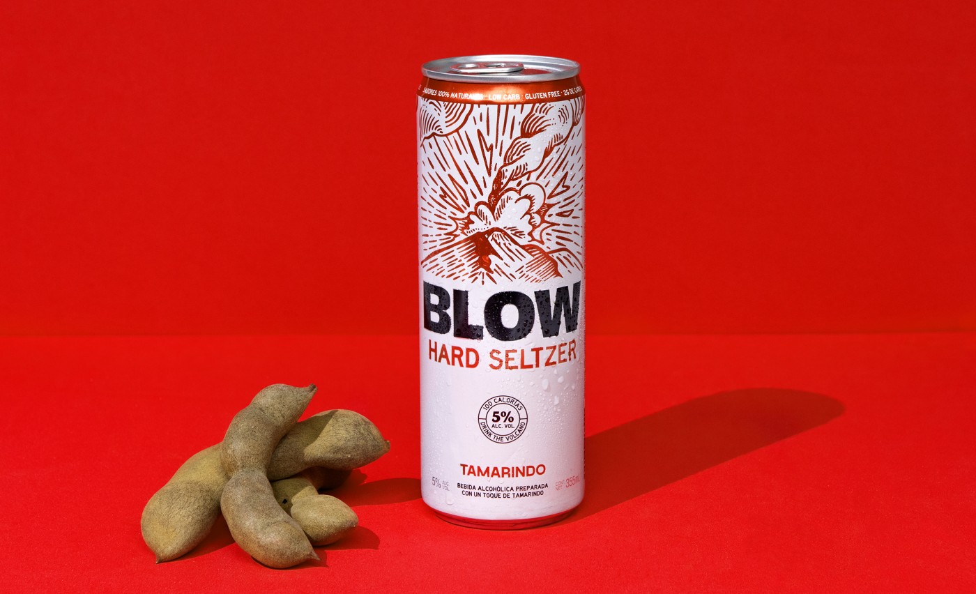
For the packaging, we had to think of ways to make Blow stand out in a crowd of seltzers. The name is intense but visually it needed much strength. We created an illustration to represent Blow's story through the can. When you read the name in bold and see the illustration you understand what the whole concept is about.
The brand voice is fun and playful but always keeps that boldness in every message. After all, Blow was born from fire, so it's only natural that it plays with fire when it speaks.
Credits
Creative: Mercedes Arce
Copywriting: Andrea De La Mora
Illustration: Gerardo Alba
Project Manager: Paulina Robles
Tags Drinks, packaging, illustration, hard seltzer.
Copywriting: Andrea De La Mora
Illustration: Gerardo Alba
Project Manager: Paulina Robles
Tags Drinks, packaging, illustration, hard seltzer.

The best agency in the business... A reliable, creative and flexible team.
Bernardo GuerraFounder Indumex
Cliente: Blow
Work:
Food & Drink
